|
|
|
|
|
|
|
|
Web User Interface
The Web User Interface (WebGUI) is a robot control and configuration tool, consisting of a set of plugins and applications developed and maintained by PAL Robotics. It is designed to simplify robot management, interaction, and the overall user experience.
The mission of the Web User Interface is to make robotics more accessible, enjoyable, and easy to use for different user profiles, including robotics engineers, and to bring service robotics into people’s daily lives.
Note
The exact list of WebGUI functionalities may vary depending on the robot and the acquired Software packages.
Accessing the WebGUI
The Web User Interface is accessible via a web browser. You can use most modern digital devices, but the best experience and full functionality are available on personal computers, such as desktops or laptops.
To access the interface, you must be connected to the same network as the corresponding robot.
Depending on the network configuration for the robot, you can access the WebGUI using the hostname or the IP address assigned to the robot.
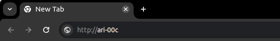
For example: http://robot-type-Xc, where robot-type is the robot’s type (e.g. ari, tiago), and X is the robot’s serial number.
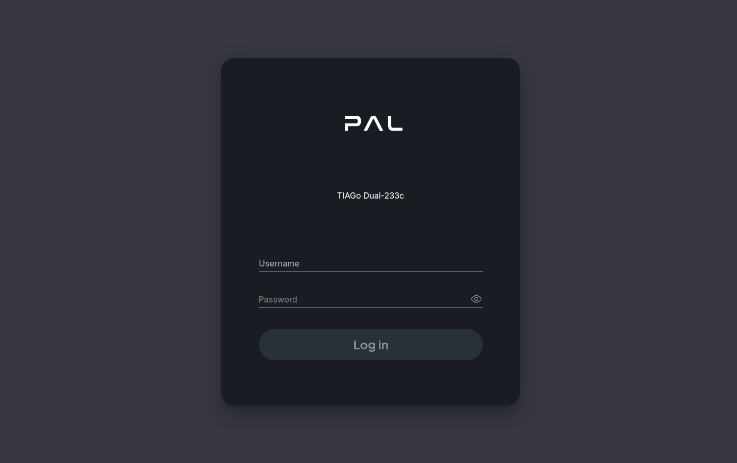
Login page
When accessing the WebGUI, a username and password will be required. The default credentials are pal / pal. You may be provided with your own user account, or you can create new user accounts from any account with administrator privileges. Check User management for more details.
Once authenticated you will automatically be redirected to the main page. The session lasts for a week, or until the user logs out, whichever happens first.
Main interface
The WebGUI interface consists of four main elements:
Top-left corner: PAL logo, which navigates back to the main page.
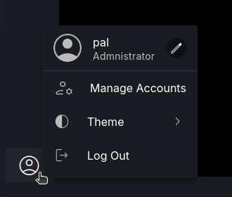
Left-side menu: Contains an account button with options such as password management and UI preferences (e.g., Dark/Light mode). It also contains a list of available web apps, which can be accessed by clicking on them.
Top-right corner: A persistent button displaying the connected robot’s model, serial number (SN), and avatar. It provides access to the Robot Panel, where you can monitor the main robot’s configuration and navigate to the Control Center for full control. The Robot Panel includes a Pin/Unpin button to show or hide it.
Main workspace: The central area of the screen, where the current application is displayed.
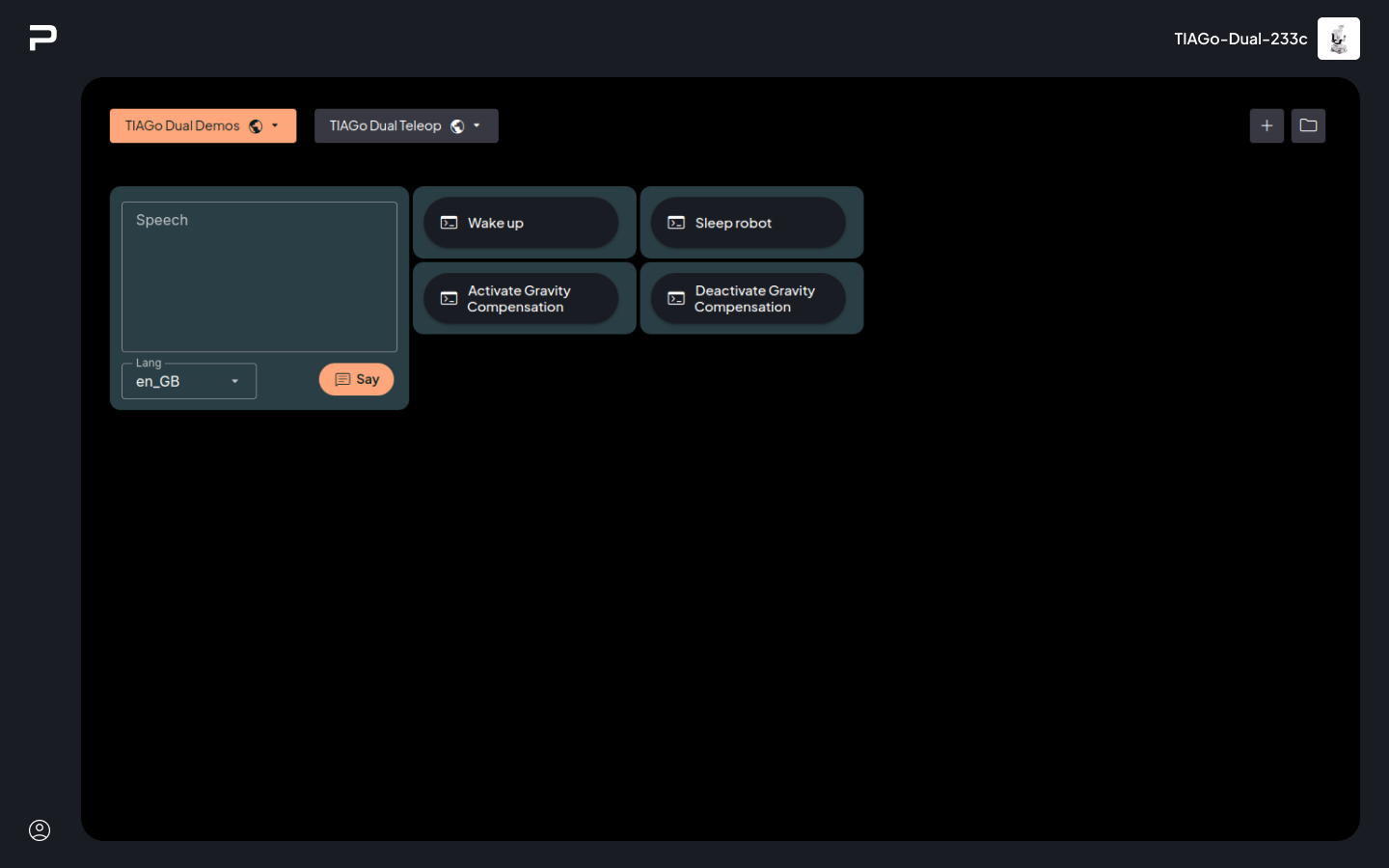
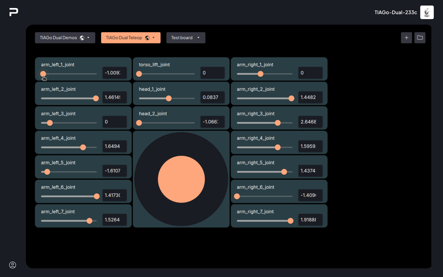
Homepage (Boards)
The Boards app is the homepage for WebGUI. This app allows the user to create and configure their own boards to monitor and teleoperate the robot. Those boards are highly customizable, which allows for a wide range of options to adapt to the user preferences at any given time.
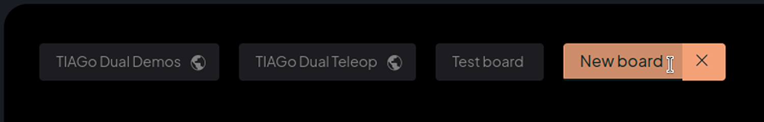
At the top of the app there is a row of boards tabs for each visible board. The
tab/button shows the name of the board, as well as an icon to differentiate
between public  and private boards. In addition, all the board tabs have a
context menu for Board management.
and private boards. In addition, all the board tabs have a
context menu for Board management.
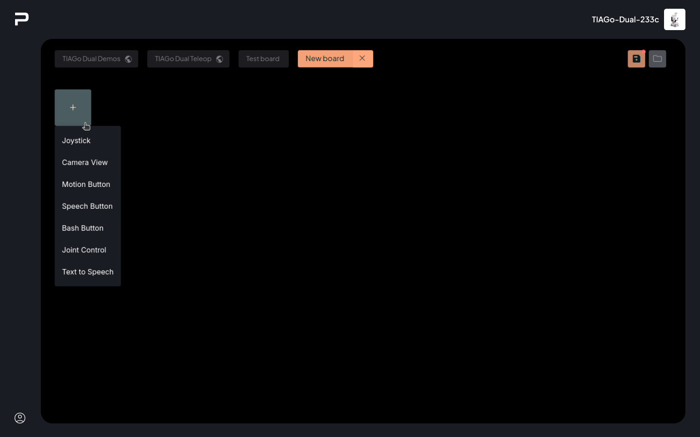
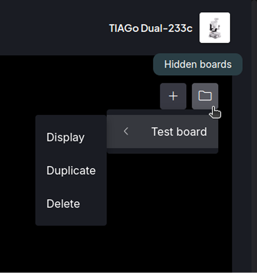
On the top right side of the app there are two buttons, an Add a new board button, and a Hidden boards button, which shows a list of boards that are currently hidden.
The rest of the space is dedicated to the current board. In it the configured widgets are shown and can be interacted with.
Create a Board
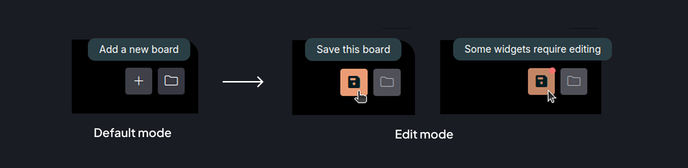
The Add a new board button on the top right of the app creates a new, empty board. When creating a board the Add a new board button is replaced by a Save board button. This button will show a red mark whenever there are issues to be fixed before being able to save the board.
Rename board
While editing a board the name of the board can be changed at any time by directly editing the label.
Add and customise widgets
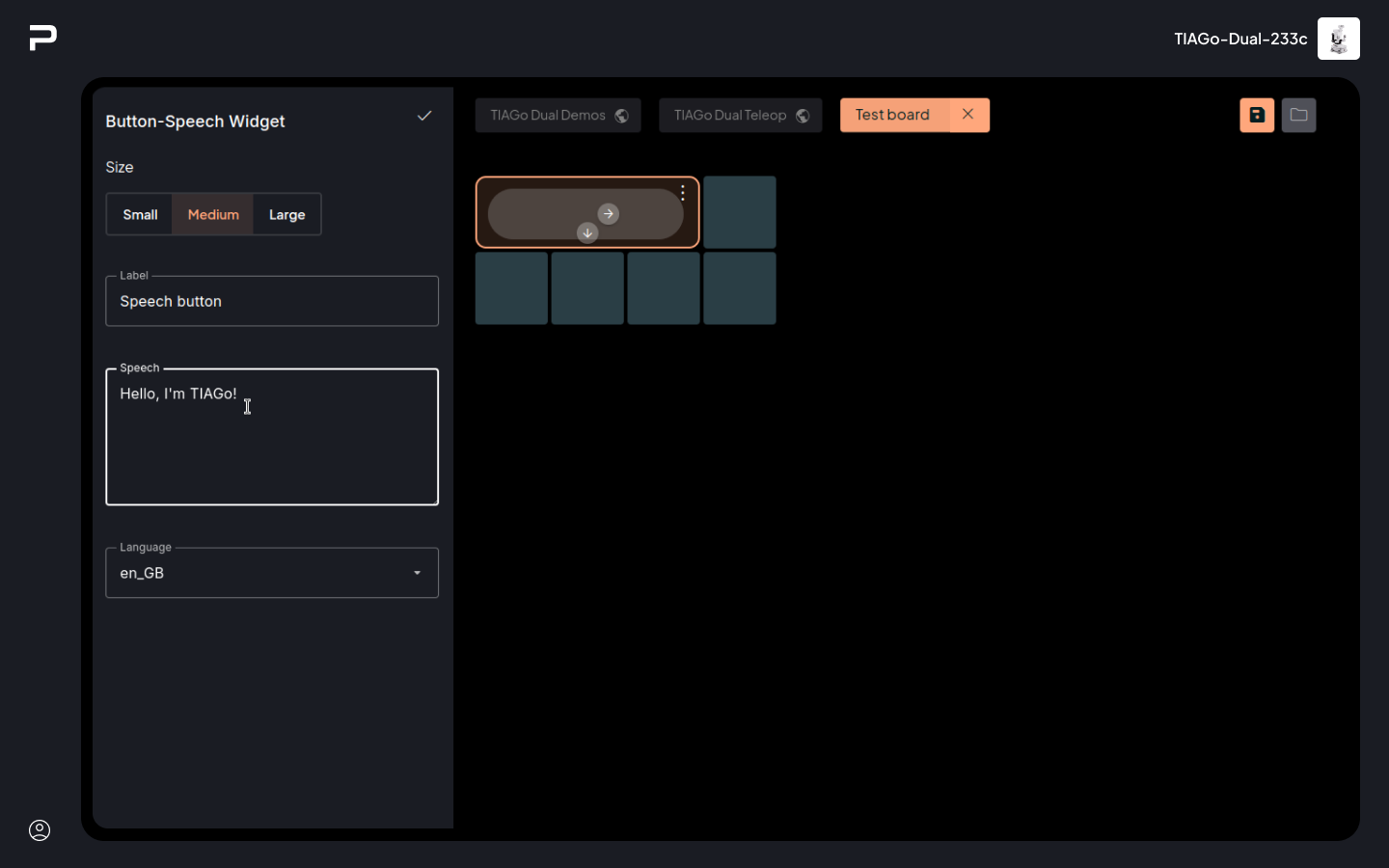
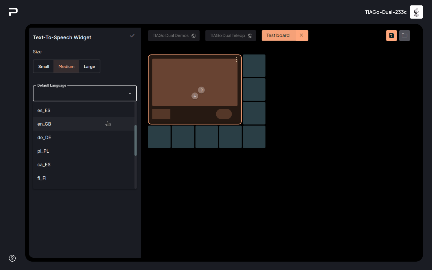
While in edit mode a grid is shown allowing the place widgets. Click on the first visible cell to open the Widget list, which will show all the widgets that can be created on that cell (taking into account size constraints and neighboring widgets).
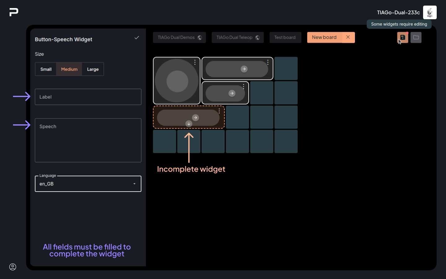
Once a widget type is selected, a panel on the left hand side of the app will open, containing the configuration options for the currently selected widget. All widgets allow size selection between three different sizes: small, medium and large. Sizes that do not fit the current space available will be disabled.
In addition an empty version of the widget will appear on the board. This placeholder displays a set of directional arrows, which allow moving the widget one cell in the corresponding direction, as long as there is space to put the widget there (otherwise the widget won’t be shown).
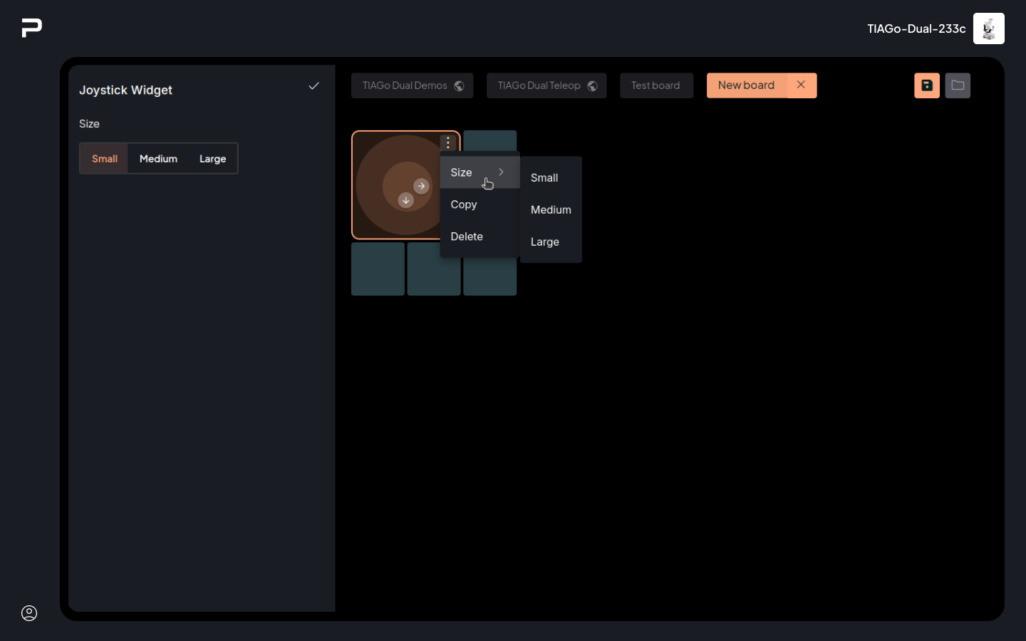
A small context menu can be accessed from the button on the top right corner. This menu allows changing size (as long as the new size is valid), copying the widget and removing it from the board. To paste a copied widget click on any empty cell, and choose the “Paste Widget” option. This option will be disabled if there is not enough space to paste that widget.
Finally, for widgets that are invalid, either because of missing or incorrect data, will be shown with a dashed border. Boards can’t be saved when they are empty, or while they contain invalid widgets.
Clicking on the currently active widget, or on the Accept button
 on the top right side of the panel will close it.
Save changes and exit edit mode
 To save the current state of the board click on the Save board
button.
To save the current state of the board click on the Save board
button.
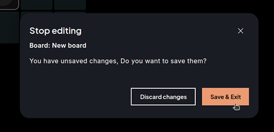
 To exit edit mode click on the cross button on the board tab.
If there are unsaved changes a popup will appear to allow saving or discarding
those changes.
To exit edit mode click on the cross button on the board tab.
If there are unsaved changes a popup will appear to allow saving or discarding
those changes.
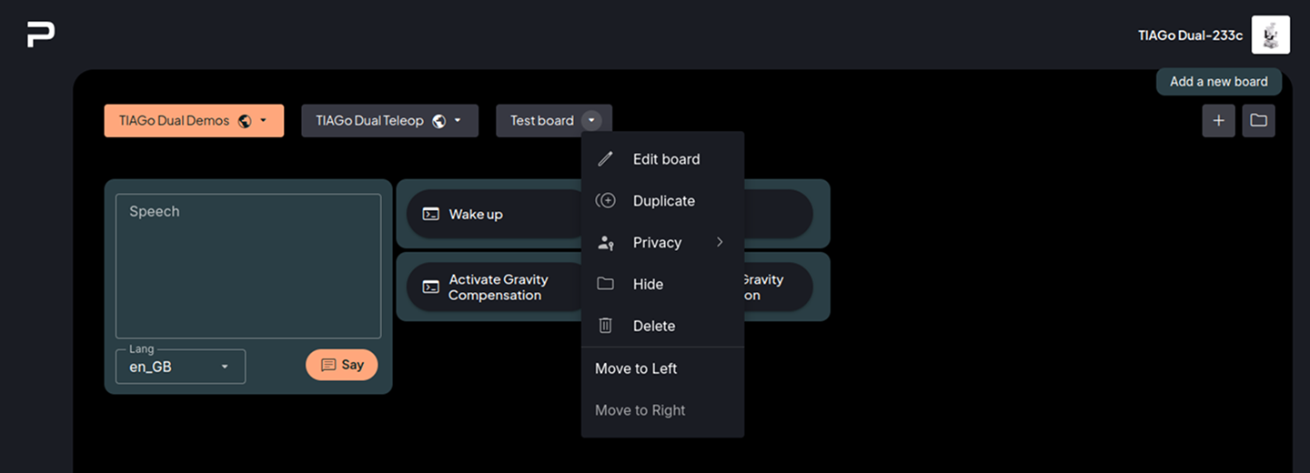
Board management
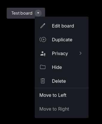
The board management context menu offers the following options:
Edit board: Switches the board to editing mode, similar to the creation mode described before.
Duplicate: Creates a new board that is a copy of this board. It automatically switches to editing mode on the newly created board.
Note
If the changes are discarded while editing this board, the copy will not be stored either.
Privacy: Allows changing the privacy of a board between public and private:
Private boards can only be seen by the user who created them.
Public boards can be seen by all users (they can only be edited or removed by their creator, though).
Hide: Manages which boards are accessible from the boards tab row. A hidden board won’t appear at the top of the app but remains accessible from the Hidden Boards menu, where a “Display” option allows restoring it (see more details below). These changes are user-specific, so if the “Public” board is marked as hidden, it is hidden only for the current user.
Delete: Permanently removes the board from the system.
Move to Left / Right: Moves the board button in the specified direction to reorder the board tabs list.
Public boards that belong to other users only show the Duplicate and Hide options.
For Boards in the Hidden Boards list, three options are offered:
Display: Unhide the board, so it is shown again on the board tabs list.
Duplicate: As in the main Board Management menu.
Delete: As in the main Board Management menu (only if the board belongs to the current user).
Widget List
The Boards app offers many widgets, availability depends on the robot characteristics.
Monitoring Widgets:
Teleoperation Widgets:
Buttons:
Visualization Widgets:
Joystick
TIAGo Family, TIAGo Base, Omnibase

The Joystick widget allows controlling the position of the robot. Moving the joystick towards the front or towards the back will make the robot start moving forwards or backwards respectively. Moving the joystick towards the sides will make the robot rotate in the same direction.
Letting go of the joystick will make the robot stop immediately.
The Joystick widget has no special configuration options.
Camera View
TIAGo Family, TIAGo Head, TIAGo Base, Omnibase
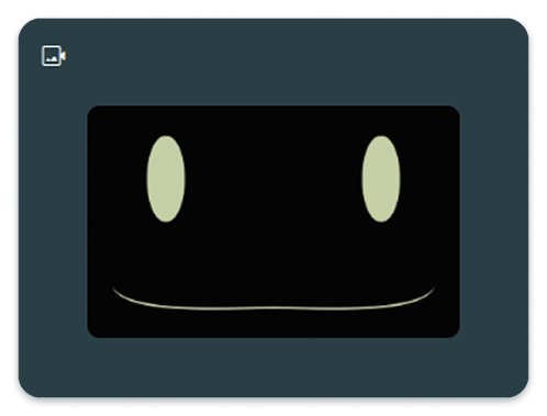
The camera view widgets show a live feed of a CompressedImage topic offered by the robot (any topic with that type on the robot can be used).
The camera view widget has one configurable property:
Image topic: The CompressedImage topic to be displayed.
Motion Button
TIAGo Family, TIAGo Head
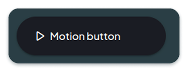
The motion button triggers a motion (executed via play_motion) when clicked. The motion can be stopped by clicking on the same button while the motion is running.
The motion button widget has two configurable properties:
Label: Text that will be displayed on the button.
Motion: Name of the motion that will be used, selectable from the dropdown list of existing motions.

Speech Button
TIAGo Family, TIAGo Head
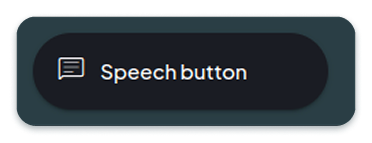
The speech button triggers a sentence to be said by the robot using the text to speech engine. The speech can be stopped by clicking on the same button while it is being uttered.
The speech button widget has three configurable properties:
Label: Text that will be displayed by the button.
Speech: Text to be said by the robot.
Language: Language code of the speech to be said.
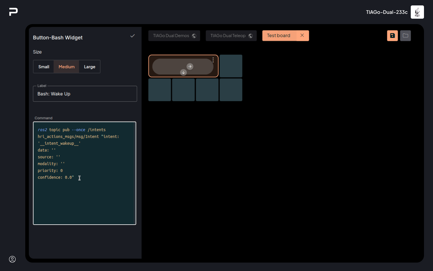
Bash Button
TIAGo Family, TIAGo Head, TIAGo Base, Omnibase

Danger
The bash button triggers a bash command on the robot. This option is potentially harmful, so care should be taken to ensure the bash commands given are not problematic for the robot.
The bash button widget has two configurable properties:
Label: Text that will be displayed by the button.
Command: Bash command to be executed on the robot.
Program Button
TIAGo Pro
The Program Button Widget can be used to launch a Visual Programming program created previously.
The Program Button widget has two configurable properties:
Label: Text that will be displayed by the button
Program: The visual programming program to be run, to be chosen from the dropdown list of created programs.
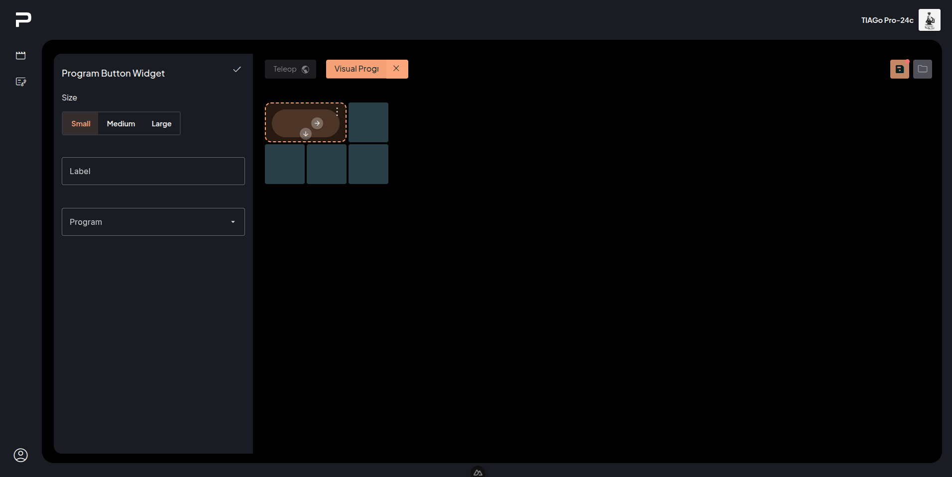
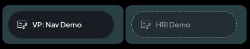
Some programs can be incomplete when added on the board, in that case the button will be disabled and show a dashed border.
Check the Visual programming app documentation for more information on how to create and manage programs.
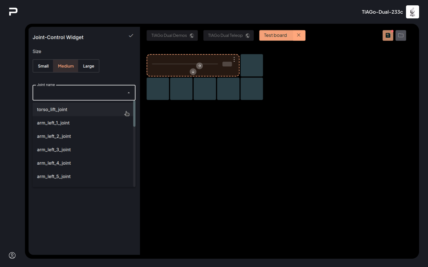
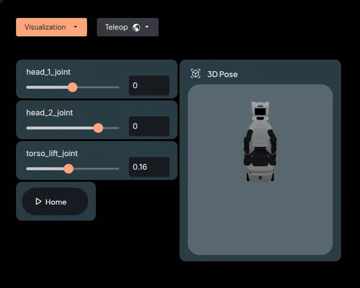
Joint Control
TIAGo Family, TIAGo Head
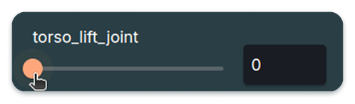
The Joint Control Widget allows control of a specific joint of the robot, either through a slider, or with a numeric input field. When the joint is being controlled a second tick will appear on the track, to show the current position of the joint.
The Joint Control widget has one configurable property:
Joint name: Name of the joint to be controlled.
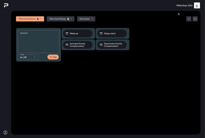
Example of a board.
Text to Speech
TIAGo Family, TIAGo Head
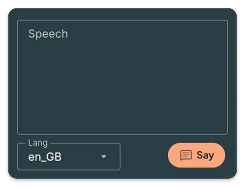
The Text To Speech Widget allows the user to write a sentence dynamically and have it said by the robot. The sentence can be written in the main area, and the language selected on the dropdown below.
The Say button will trigger the utterance of the sentence as is. It will switch to a Stop button which can be used to stop the speech early.
The Text to Speech Widget has one configurable property:
Default Language - language that will be chosen by default on the widget (it can be changed dynamically as well).
3D Pose
TIAGo Pro
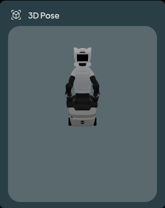
The 3D pose widget displays the robot’s pose based on the feedback of the joints.
This widget has no special configuration options.
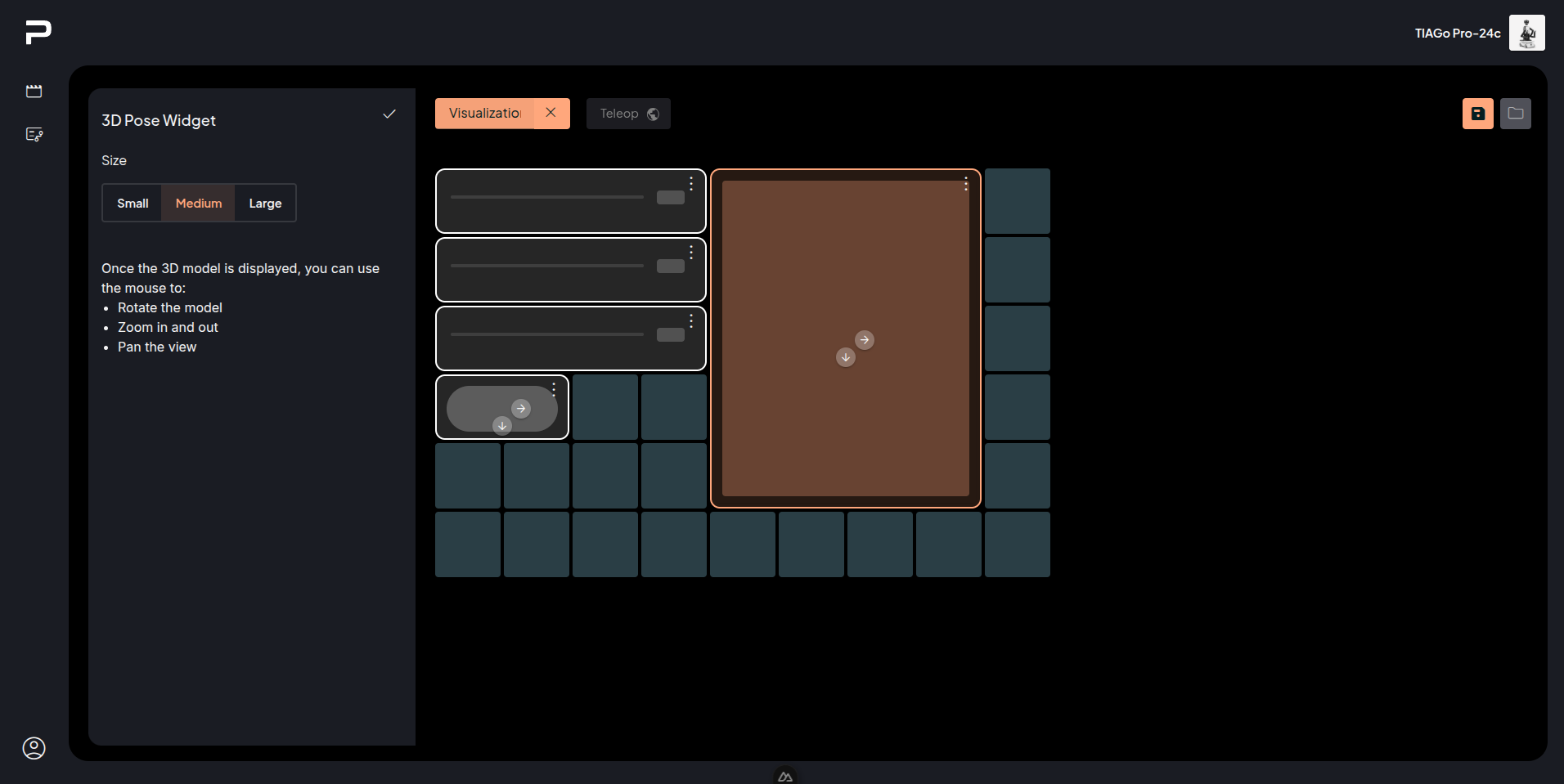
Interacting with the Widget using the mouse:
Left click and drag to rotate
Wheel to zoom in and zoom out
Right click and drag to pan.
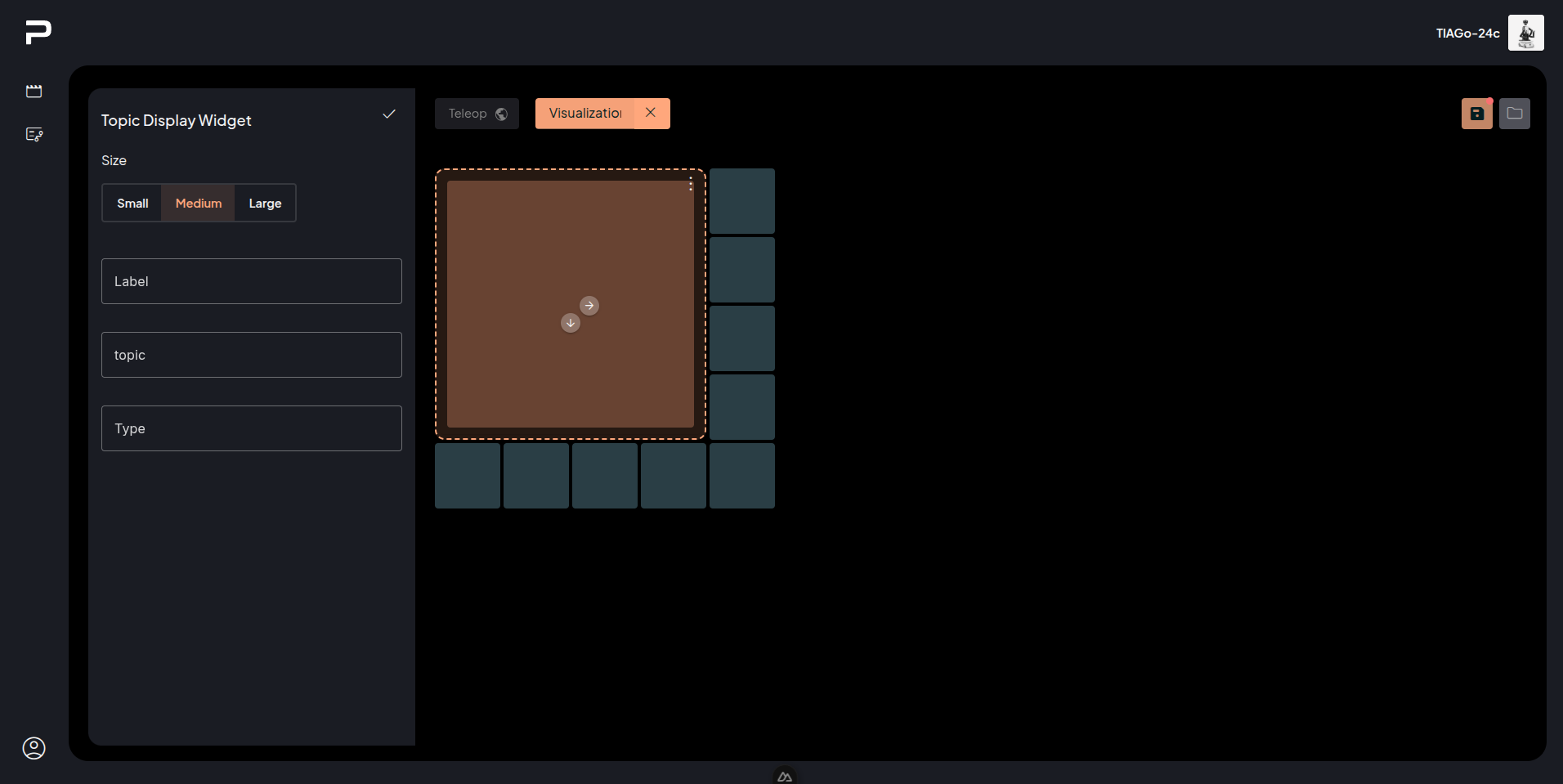
Topic Display
TIAGo Pro
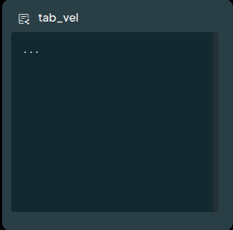
The Topic Display Widget displays the latest message received on the selected ROS topic.
The topic display widget has three configurable properties:
Label: Name displayed by the widget.
Topic: the ROS topic to display
Type: the ROS message type for that topic.
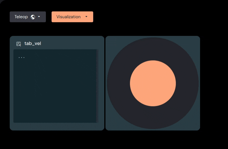
Below is an example of the /tab_vel topic with the type geometry_msgs/msg/Twist.
Note that, while there was no message received on that topic, it shows an ellipsis.
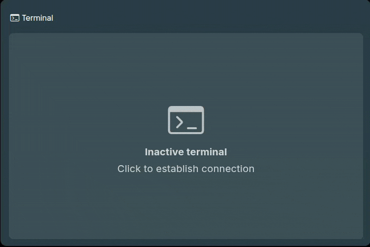
Bash Terminal
All robots
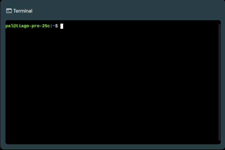
The Bash Terminal widget spawns and emulates a terminal process, allowing interactive command and process execution on the robot.
This widget has no special configuration options.
When the terminal first appears on the board, it is inactive. Clicking on the terminal establishes a connection.
Keyboard Shortcuts for the Terminal:
Ctrl + Insert: Copy from the terminal.
Shift + Insert: Paste into the terminal.
Note
Going to a different board or app will disconnect the terminal.
User Management
The WebGUI uses a User / Password model of authentication to keep track of individualized data and preferences for each User.
Users types
There are two categories of users: Regular users, and Administrators. Both Regular and Administrator users have full access to all the features offered by the WebGUI, however, only Administrator users can manage other users.
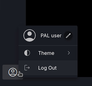
Regular users can change their own password using the Reset Password button next to their user name in the Account menu.
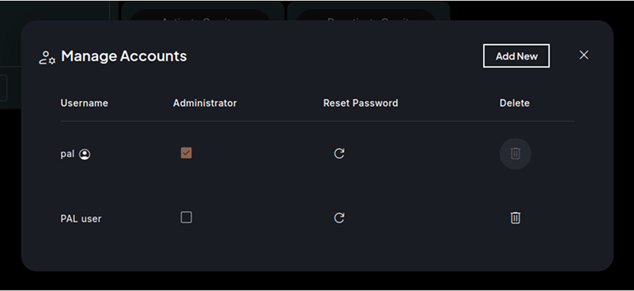
Administrator users will see their status indicated under their username. In addition, Administrator users have access to the Manage Accounts panel, which allows creation, modification, and removal of users.
Manage accounts
The Manage Accounts panel shows a list of all users in the application. The current user is shown first, followed by the pal user, and then all other users in alphabetical order. For each user, elements are shown to display:
Administrator status: It can be changed by clicking on the checkbox to enable/disable Administrator status. This action can’t be done for the current user, nor for the pal user.
Reset Password: This option allows changing the password of a user.
Delete: This option allows the permanent removal of the user from the system. This action can’t be performed neither for the current user, nor for the pal user.
Add new user
The Add New button on the top right of the panel allows the creation of a new user:
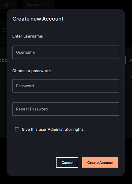
To create a new user, supply the username, choose an initial password, and then check the Administrator rights option if desired. If an error occurs during the creation of the user (i.e., because the username is already in use), a snackbar error message will appear.
Control Center
The Control Center is a WebGUI feature designed to monitor and manage the robot’s current state and configuration. It consists of two primary components:
Robot Panel, which provides an overview of the robot’s status and serves as an entry point to the Control Center.
Control Center, which allows for a detailed view of the robot’s state and enables configuration modifications.
Robot Panel
The robot panel provides a quick overview of the robot’s status, including essential robot information, networking settings, and diagnostics, among others. It is divided in the following sections:
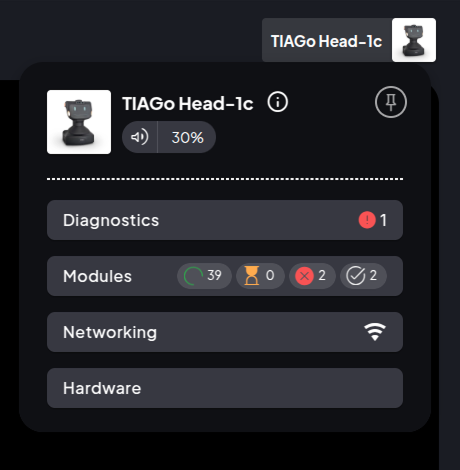
Robot Info Header
Displays key details about the robot, such as:
Robot name and serial number
PAL O.S. version
Additional information (depending on robot)
Battery and charging status
Volume control
Pin/Unpin button to keep the panel visible on the screen or hide it.
Plugin buttons with state indicators
This section is made up of different plugins available on the robot (which may vary from robot to robot), each offering a summary of its status. For example, the Modules plugin button displays the number of modules in different states: running, waiting, finished, crashed, etc.
Clicking on the plugin button opens the Control Center, providing a detailed view and options for that selected plugin.
Control center panel
The Control Center panel provides a detailed view of the robot state, and also allows modification of its configuration. It consists of three main sections:
Robot Info Header
The information displayed in this header is the same presented in the Robot Panel.
The left sidebar lists the available plugins and highlights the currently accessed one with a colored dot icon.
Plugins Section
The main display area, with the content for the selected plugin; enabling configuration modification and richer and more detailed monitoring.
Control Center Plugins
Diagnostics
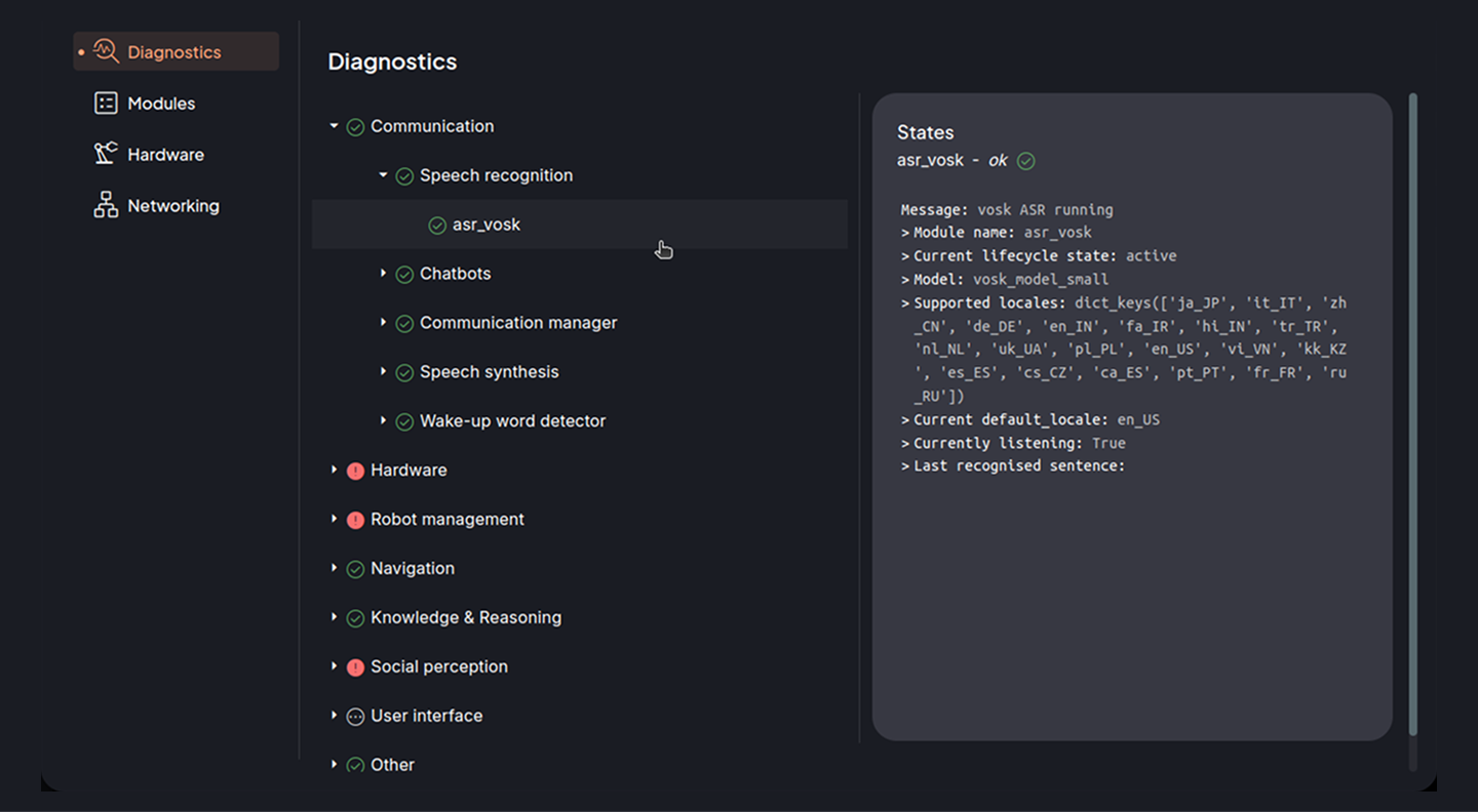
The Diagnostics plugin displays information published by the diagnostics aggregator collected from different sources on the robot.
Robot panel
The summary of the Diagnostics button, will show the count of diagnostics that are in error or warning state.

Control center
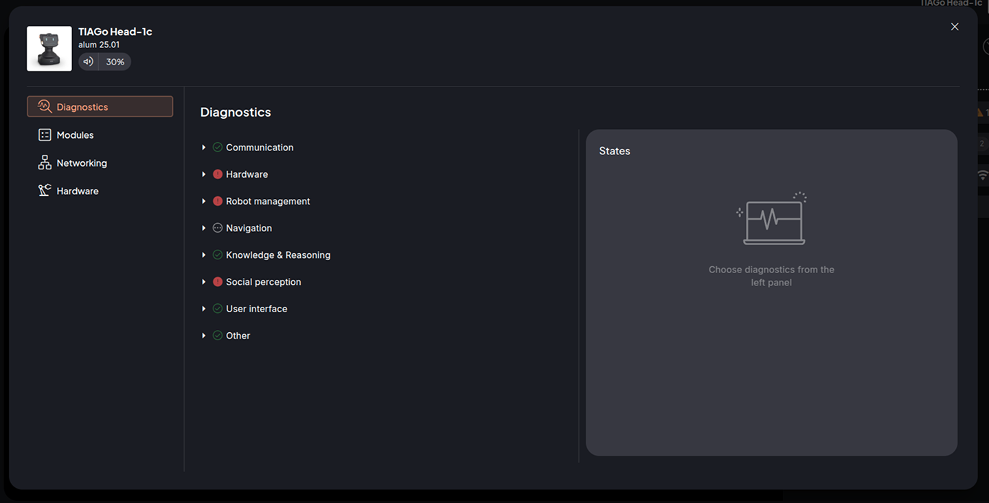
The diagnostics data is organized as a hierarchical tree, where each node represents a diagnostic and may contain sub-diagnostics. Each node displays its name and an icon indicating its current status.
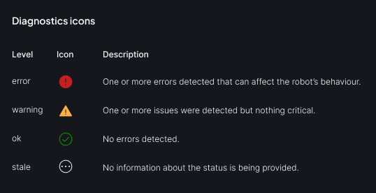
Clicking a node expands its list, revealing any subgroups or items. On the right side of the screen, the States container displays the latest message and entries for the selected diagnostic.
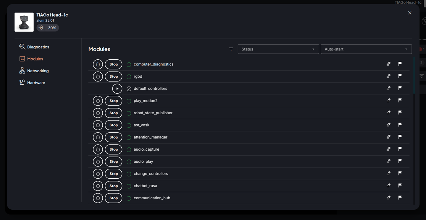
Modules
The PAL Module Manager is the process that manages the startup of the robot and defines which applications are started. Check the PAL Module Manager documentation for information about the modules.
Robot panel
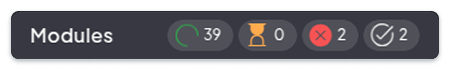
The summary for the Module plugin shows a count of how many modules are in the status:
running
waiting
crashed
finished
When a specific status button on the robot panel is clicked, the Modules plugin opens in the Control Center and displays a filtered list corresponding to the selected status.
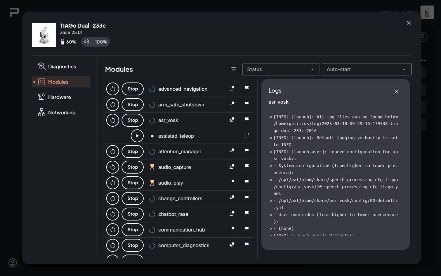
Control center
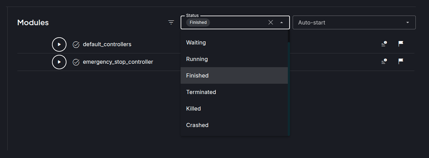
The interface consists of two sections: a modules list with management buttons and filters at the top.
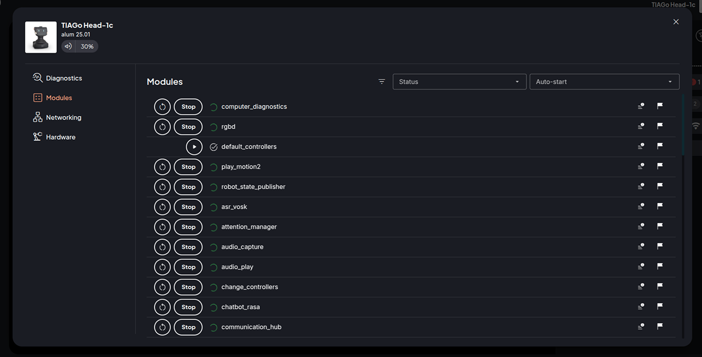
You can filter the module list by status and/or enabled/disabled state.
Each module in the list includes the following options: Start/Stop buttons, a status icon, the module name, and icon buttons to access logs and toggle the module’s autostart state (enabled/disabled).
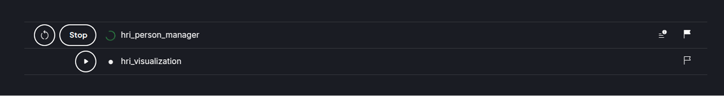
If the module is running, the Restart and Stop buttons are displayed. If the module is in any other state, only the Start button is shown.
An icon displayed next to the module name reflects its current status.
On the right end of the module list item, there are two buttons:
Logs button, to view the logs for the selected module.
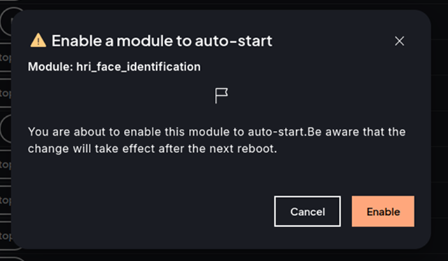
Flag button, allows enabling or disabling the autostart of the module.
Logs button
The modules with Logs available will have the Logs button displayed. Click it to access the Logs container.
Module autostart button
 If the Flag appears empty it means the module is either in a
LOADED state, meaning it is not included in any module set, or it has been
disabled previously, so it does not autostart when the PAL module manager is
restarted.
If the Flag appears empty it means the module is either in a
LOADED state, meaning it is not included in any module set, or it has been
disabled previously, so it does not autostart when the PAL module manager is
restarted.
 In case the flag appears filled it means this module is
started automatically when the PAL Module manager is started, either because
the module was in the module set or because it was enabled previously.
In case the flag appears filled it means this module is
started automatically when the PAL Module manager is started, either because
the module was in the module set or because it was enabled previously.
Clicking on the flag will prompt you to switch its enabled/disabled status based on its current state.
Note
Be aware that changes to the module’s autostart state (enabled/disabled) will take effect after the next robot reboot.
Hardware
The Hardware plugin allows viewing and editing hardware information on the robot.
Robot panel
The summary of the Hardware button shows the count of how many RT devices are set to dummy, current end-effector, etc.

Note
The actual hardware information can vary from robot to robot.
Control Center
RT Dummy Devices
View, set, and unset RT Devices to dummy.
The section consists of the following type groups:
Actuators
Sensors
IOs (input outputs)
Each device type group contains the list of devices corresponding to it. For actuators and sensors, the devices can be grouped based on their prefix to select or unselect multiple devices at once.
Note
Some robots can come without any sensor dummy device, in that case only actuator and IO devices are shown.
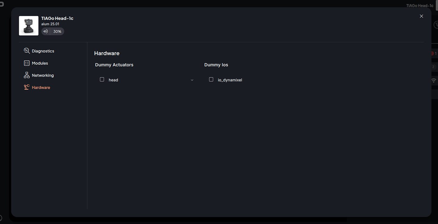
The devices that already have their checkboxes marked are the ones previously set as dummy.
While you are marking or unmarking the checkboxes, you can click the RESET button to go back to original values for all the devices.
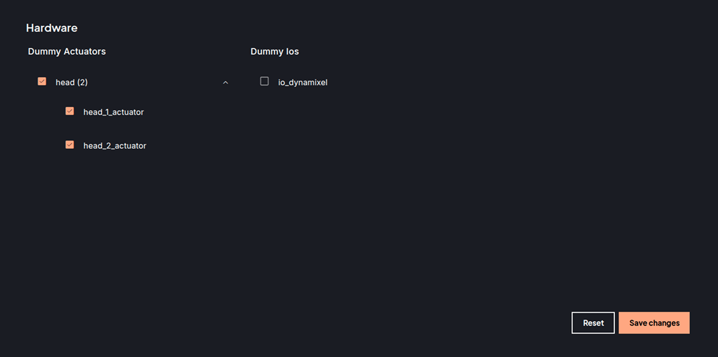
After marking the devices you want to set or unset as dummy, click on the Save changes button and confirm the prompt.
Note
The robot must be restarted for the changes to take effect.
Networking
Networking managment is dependent on the robot type.
Mikrotik
Robot panel
The robot panel summary displays an icon with ‘API Mismatch’ error in case there was an error connecting with the Mikrotik Router onboard the robot.

Control Center
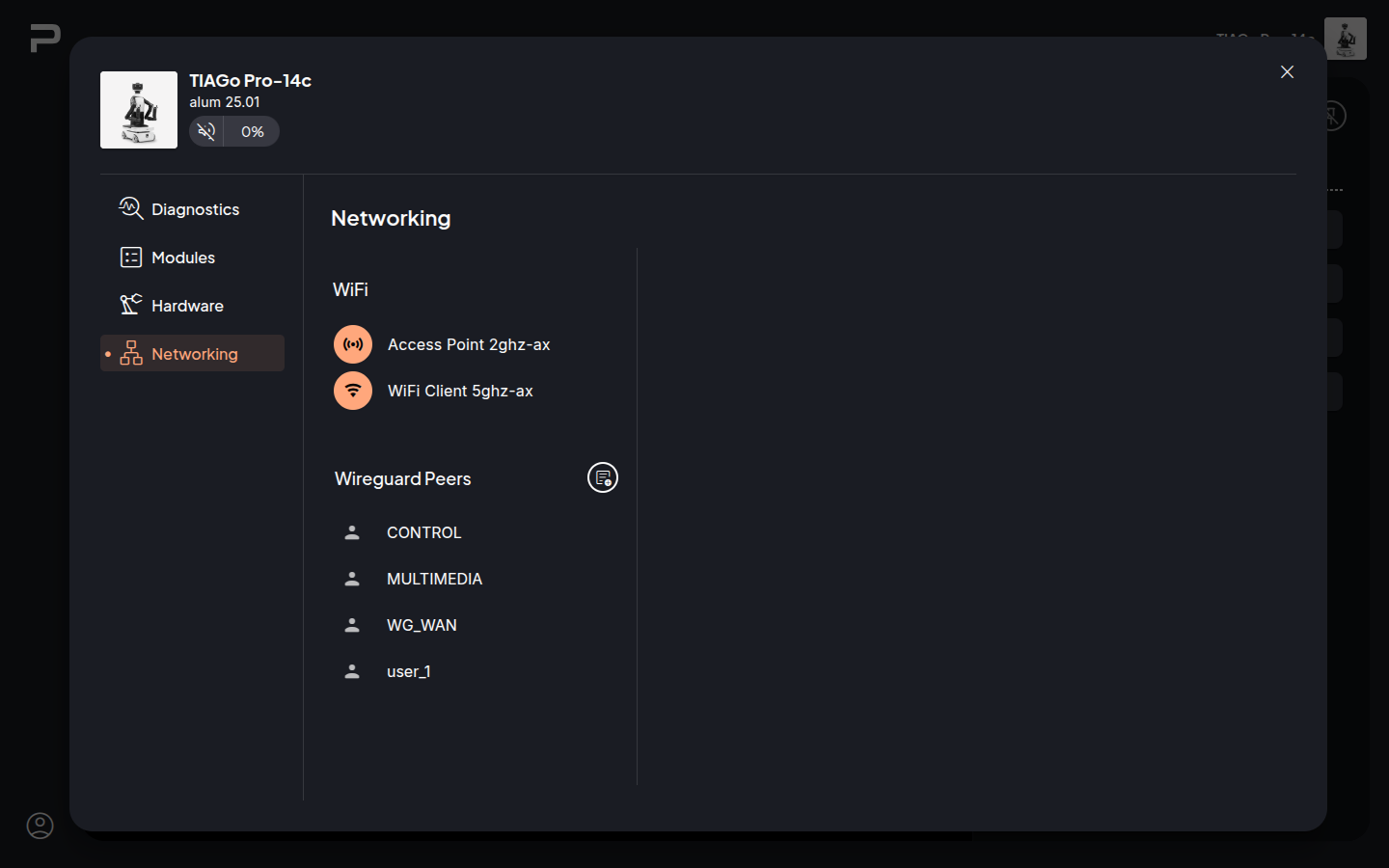
The Mikrotik Networking plugin allows to view and edit the configuration for both WiFi interfaces and also view and create Wireguard peers configurations.
Access Point configuration
Clicking on Access Point 2.4GHz the network editor will open on the right.
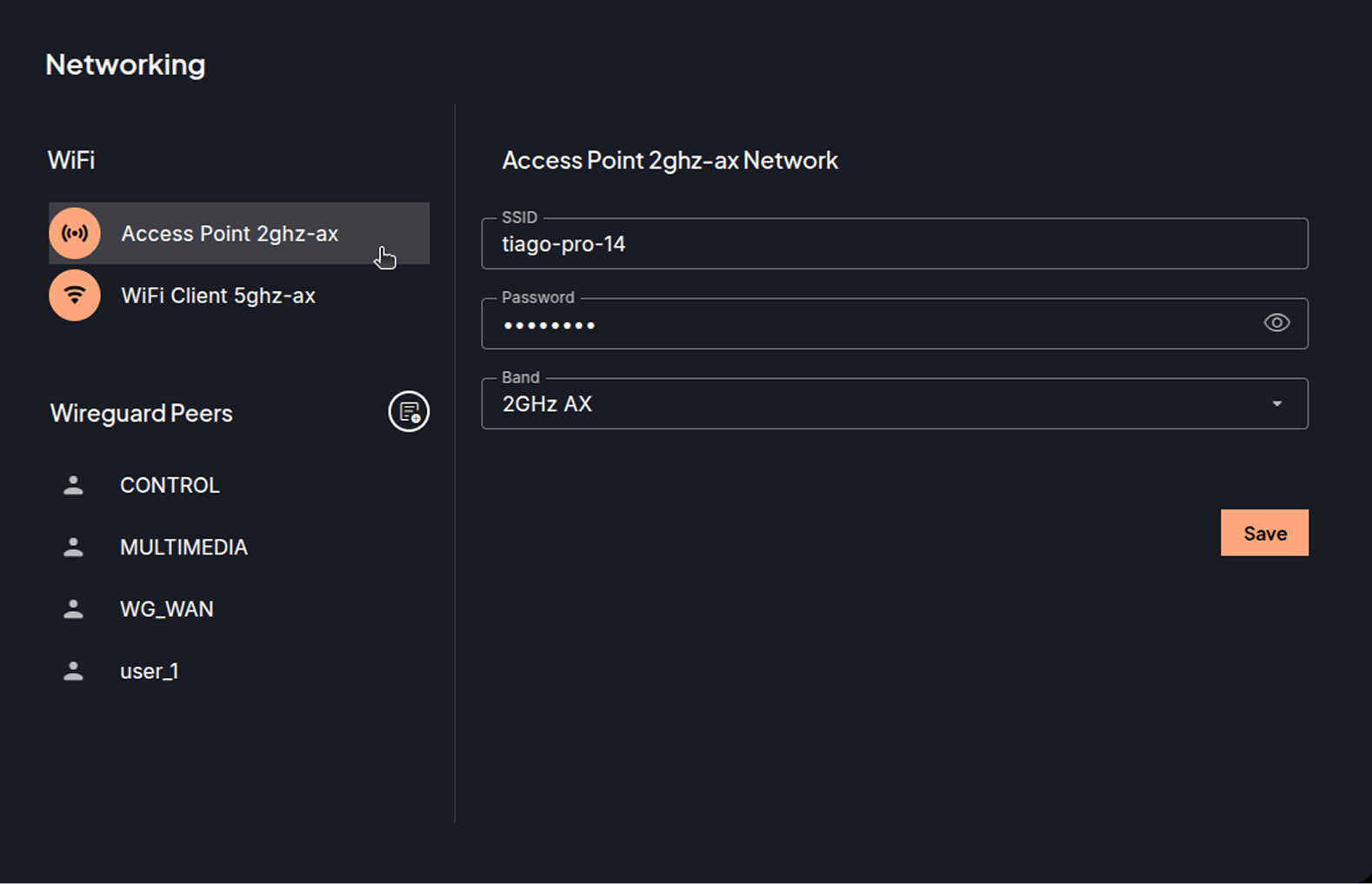
When the editor is opened, the fields are showing the current configuration of the network.
There are the following fields which can be edited:
SSID, name with which the network will be discoverable.
Password, with which the access point network can be connected. The eye icon on the password field allows to toggle the password visibility.
Band, allows selecting the band frequency standard from the available options.
Clicking on Save will prompt to confirm saving the modifications.
Clicking on the close button in the upper right corner of the editor wlll exit without saving any changes.
Client WiFi configuration
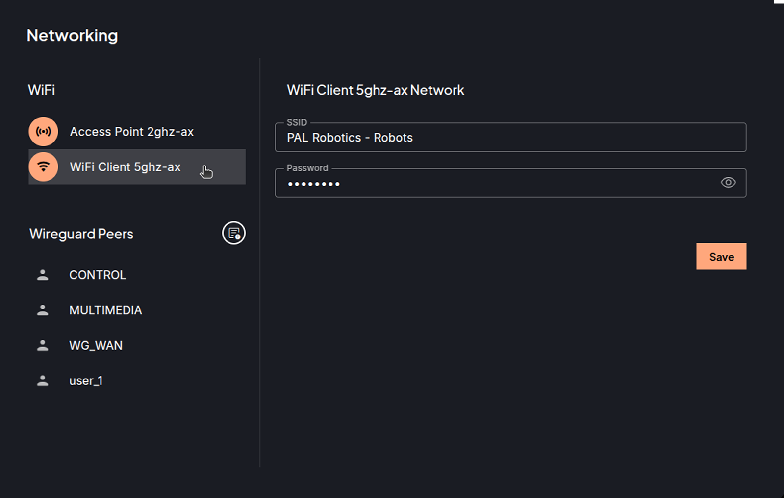
Clicking on WiFi Client 5Ghz opens the editor to modify the following fields:
SSID, name of the WiFi network for the robot to connect to.
Password, for the network.
Clicking Save will prompt to confirm the changes.
Wireguard peer setup
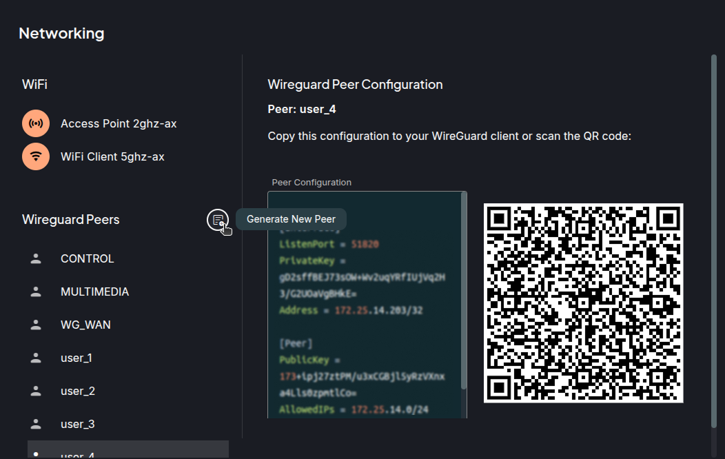
From this networking plugins new peers can be created or viewed for the Robot LAN through the Mikrotik router.
Create
Clicking on the Generate Peer button, it will generate a new peer configuration for a device.
Take note of the user assigned for the created peer configuration to later reuse it.
View
Clicking on a configuration from the Wireguard Peers section, will open the editor with configuration for the selected peer.
Note
The CONTROL, MULTIMEDIA, and WG_WAN are reserved configurations for the computers onboard the robot.
Copy this configuration in a wg conf file or scan the QR from the Wireguard app to start using the wireguard tunnel.
Netplan
The networking plugin is used to manage the robot’s networking settings.
The robots use Netplan, a utility for networking configuration on Linux systems. The Networking application provides an easy to use interface to manage the Netplan configuration files (YAML).
Robot panel
The robot panel will show different icons depending on the current active configuration. Hovering over the icon will show the name of the profile associated with the active network type.

Control Center
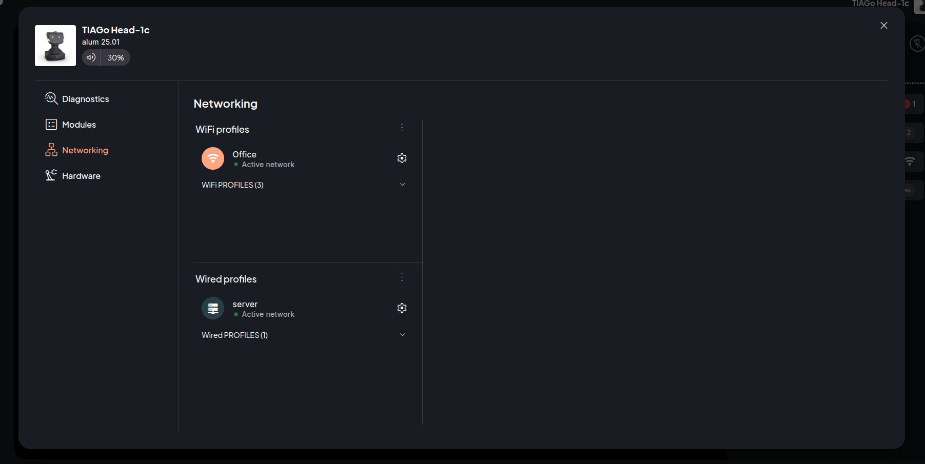
Profile Groups
There are two profile list groups:
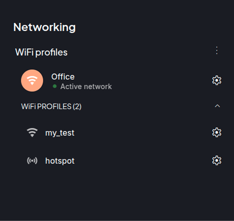
WiFi Profiles
Wired profiles
A profile is the network configuration that can be created and managed by the user. You can enable a profile to set it as the active configuration for the network settings. There can be WiFi profiles or Wired profiles.
Note
The items explained below have the same structure and options for both the WiFi and Wired groups.
The network groups have the following items (the given examples / names are based on the WiFi group):
Group title: WiFi Profiles, shows the name of the group the profiles belong to.
Group context menu, click to open the context menu, from here you can add a new profile to the group or disable the network group. In this example, it would mean it will turn off the WiFi.
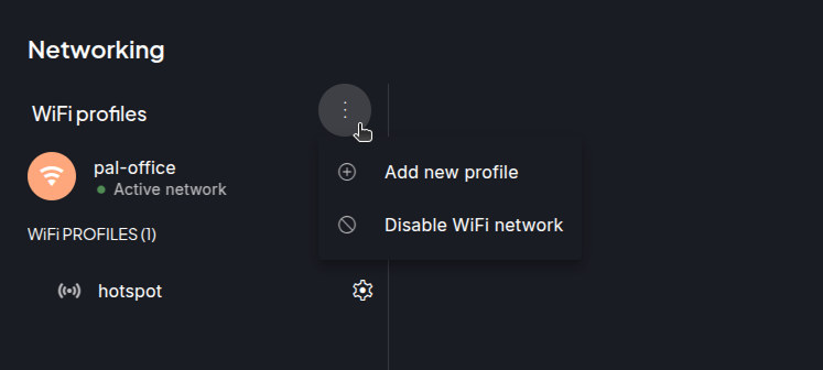
Add new profile: Opens the editor to create a new profile
Disable WiFi network: Prompts you to confirm the network disabling (like WiFi or Wired).
Warning
Disable WiFi network option allows turning the WiFI network off permanently until you enable it again. If both network groups are disabled, it means the only way you can connect to the robot is physically using an ethernet cable.
Active profile: shows the profile that is being used currently for a network group (WiFi or Wired). Both groups can have a profile active meaning that the network group is enabled.
Mode identification icon: each profile will show a different icon depending on what mode it is.
Custom mode
 : When a profile is created using the
advanced mode (inserting the YAML configuration), there can be some
fields that the parser does not understand.
: When a profile is created using the
advanced mode (inserting the YAML configuration), there can be some
fields that the parser does not understand.WiFi Access Point mode
 : the robot functions as a
WiFi access point, allowing other devices to connect to it.
: the robot functions as a
WiFi access point, allowing other devices to connect to it.WiFi Client mode
 : the robot connects to a WiFi
network as a client, allowing to connect to the Internet and other
resources on the network.
: the robot connects to a WiFi
network as a client, allowing to connect to the Internet and other
resources on the network.Wired client mode
 : the robot connects to a
network using a wired connection. This mode allows the robot to access
the network and communicate with other devices on the same network.
: the robot connects to a
network using a wired connection. This mode allows the robot to access
the network and communicate with other devices on the same network.Wired server mode
 : The robot functions as a
network bridge, connecting multiple wired network segments. In this mode,
the robot manages the bridge connection, facilitating and directing
traffic between the different network segments.
: The robot functions as a
network bridge, connecting multiple wired network segments. In this mode,
the robot manages the bridge connection, facilitating and directing
traffic between the different network segments.
All profiles: list of all the available profiles previously created. It can be empty if the profiles list contains only one profile and it is active (example below).
All profiles list item: By clicking on its name the configuration will be displayed.
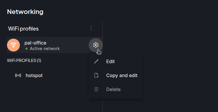
Profile list item context menu: Click to access the available options for a specific profile:
Set as active: Sets the selected profile as active configuration for the group. You will be prompted to confirm setting the profile as active.
Note
Depending on the active configuration you might lose connection to the robot. The change of active profile is a permanent action. Once it is done your device will lose connection to the robot until you reconnect with the new configuration.
Edit: Open editor to edit profile configuration.
Note
Some profiles come by default (default profiles), these profiles can not be edited or deleted. The following are the names of these default profiles, for WiFi: hotspot, and for Wired: server and client.
Copy and edit: Use it to create a new profile starting from the same configurations.
Delete: this action is irreversible. You will be prompted to confirm the deletion of the profile.
EDITOR
The editor allows you to configure the profile. The editor can be opened in the following ways.
Adding a new profile, click on the Add new profile in the group context menu to open the editor.
Edit an existing profile, select the Edit option from a profile’s context menu.
Create a new profile from an existing one, select Copy and edit from a profile’s context menu.
Clicking on profile, when a profile is clicked, the editor is opened in a view mode, meaning that you cannot edit. A button to enter edit mode is available.
Adding new profile
Adding a WiFi profile
Select Add new profile to create a new network configuration from the group context menu. The editor will open a form with a series of fields, on the left of the editor and a Save button at bottom right.
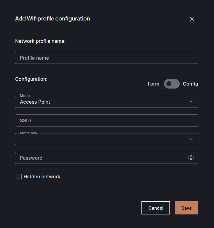
The fields explained:
Profile Name: This is the name that is shown in the list of profiles in the group.
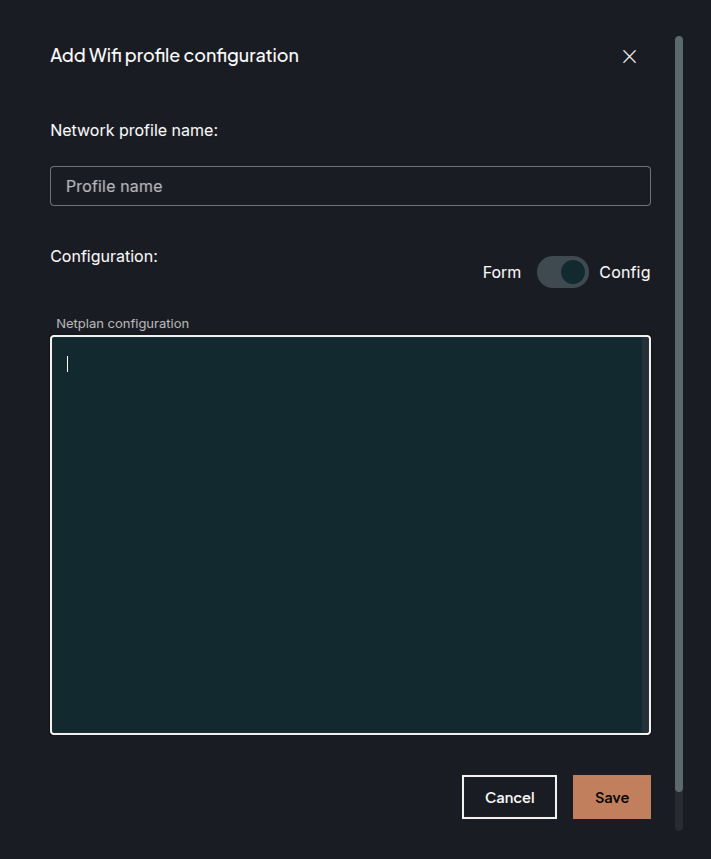
Edit tool: For WiFi configuration there are two options to create a profile.
Form: Fill out the fields with only the minimum required information for connecting to a WiFi or creating a hotspot.
Mode: Select if the profile will act as WiFi client or as an Access Point.
SSID: Name of the client WiFi or name with which the access point will be discoverable.
Mode key: Security mode of the WiFi network.
Password: Enter password for the client WiFi or set the password for the robot’s access point. For an access point profile the password must meet the following requirements:
Minimum 8 characters
Minimum 1 uppercase character
Minimum 1 lowercase character
Minimum 1 number
Minimum 1 special characters
Hidden: Checkbox to mark if the network is hidden or not. A hidden network is a wireless network that is not broadcasting its SSID. It is invisible to other devices searching for a new network to join. Example: when setting a robot as an access point and configuring it as a hidden network, the SSID set will not show in the list of your device’s available WiFis list.
Insert configuration: Type the network configuration as if you were editing the file directly or drag and drop an external configuration file (YAML) inside the text field. This is intended for advanced users, you are able to use the full available configuration for Netplan.
Note
No validation is performed when you save this configuration. So be sure the YAML you typed or inserted is correctly formatted and configured.
Additional links:
Available Netplan configuration: https://netplan.readthedocs.io/en/stable/netplan-yaml/
Check your YAML: https://www.yamllint.com/
Click on the Save button to save your configuration and the new profile will be shown in the profile list.
Adding a wired profile
For creating new wired profiles only Insert configuration mode is available. Enter a name for your profile, write the netplan compliant YAML configuration, and save. You also have an option to drag and drop the configuration file inside the text field, so it will be processed as a plain text.
Click the close icon (top right corner) to exit the editor without saving changes.
Edit existing profile
You can edit the configuration of an existing profile (unavailable for default profiles). In case of WiFi the fields will be shown to be edited if the edit tools was Fill form or the YAML code will be shown to be edited in case the edit tool was Insert configuration or the profile is of ethernet type. After making changes click Save.
Click the close icon (top right corner) to exit the editor without saving changes.
Create new profile from an existing one
When selecting Copy and edit from the context menu of the profile, the editor is opened to create a new profile. The fields are already filled out from the selected profile. You can edit these fields to your liking and save as normally done creating new profiles.
Click the close icon (top right corner) to exit the editor without saving changes.
View profile
Clicking on profile will open the editor with that configuration. The configuration will be shown in the same edit tool that was used for creating the profile.
In case of WiFi profile, if it was created using the Fill form it will show the fields and in case of the Insert configuration the YAML block will be shown. For Wired profiles the YAML block is shown.
The editor will be in view mode, so no editing can be done. Click on the Edit button to switch to edit mode, and this way you can edit the YAML configuration or modify the filled fields.
In the view mode there are also options for setting the profile as the active for the given group or deleting it, same as in the profile context menu.
In case of default profiles available on the robots, options to delete or edit them are disabled from the web interface.
Click the close icon (top right corner) to exit the editor.
Web Apps
The Web User Interface is comprised of several web applications that provide different functionalities. Here is a list of available applications:
Note
The exact list of Web apps available on the robot may vary depending on the robot type and the installed software.
Motion Builder
The Motion Builder is a web app for creating and executing prerecorded motions on the robot. It includes a motion list, a visual editor with a real-time 3D robot model featuring camera controls, and a visual timeline.
The Motion Builder app is documented in its own page.
Visual programming
The Visual Programming is a web based app used to create programs for the robot in a simple and user friendly way. It consists in creating graph structures to manage actions that need to happen in a specific order using nodes. Each node in the graph is an action with a unique ID and tells the system what to do next. For most nodes, error handling can be configured to either, do something in case of error, or ignore it.
The Visual Programming web app consists of a Start page, a list of previously created programs and ways to manage them, and an Editor page, where program graphs can be created or edited.
The Visual programming app is documented in its own page.