Touchscreen manager#
Important
This documentation corresponds to software available only in the Gallium PAL Robotics distribution.
One of the features of PAL’s robots is its capability to interact with users through its touchscreen. This is specially useful to enhance the user experience with end-users, where it is often necessary to either provide visual input to the user (e.g. displaying images or videos), or to obtain input through interactive screens.
The Touchscreen Manager is a WebApp that allows you to create and manage projects that consist of web pages which can be displayed on robot’s touchscreen.
The WebApp contains a start screen to visualize and manage projects and pages and also, a visual editor to edit page content, as well as an editor of Overlay Elements that defines the page flow.
Start screen interface#
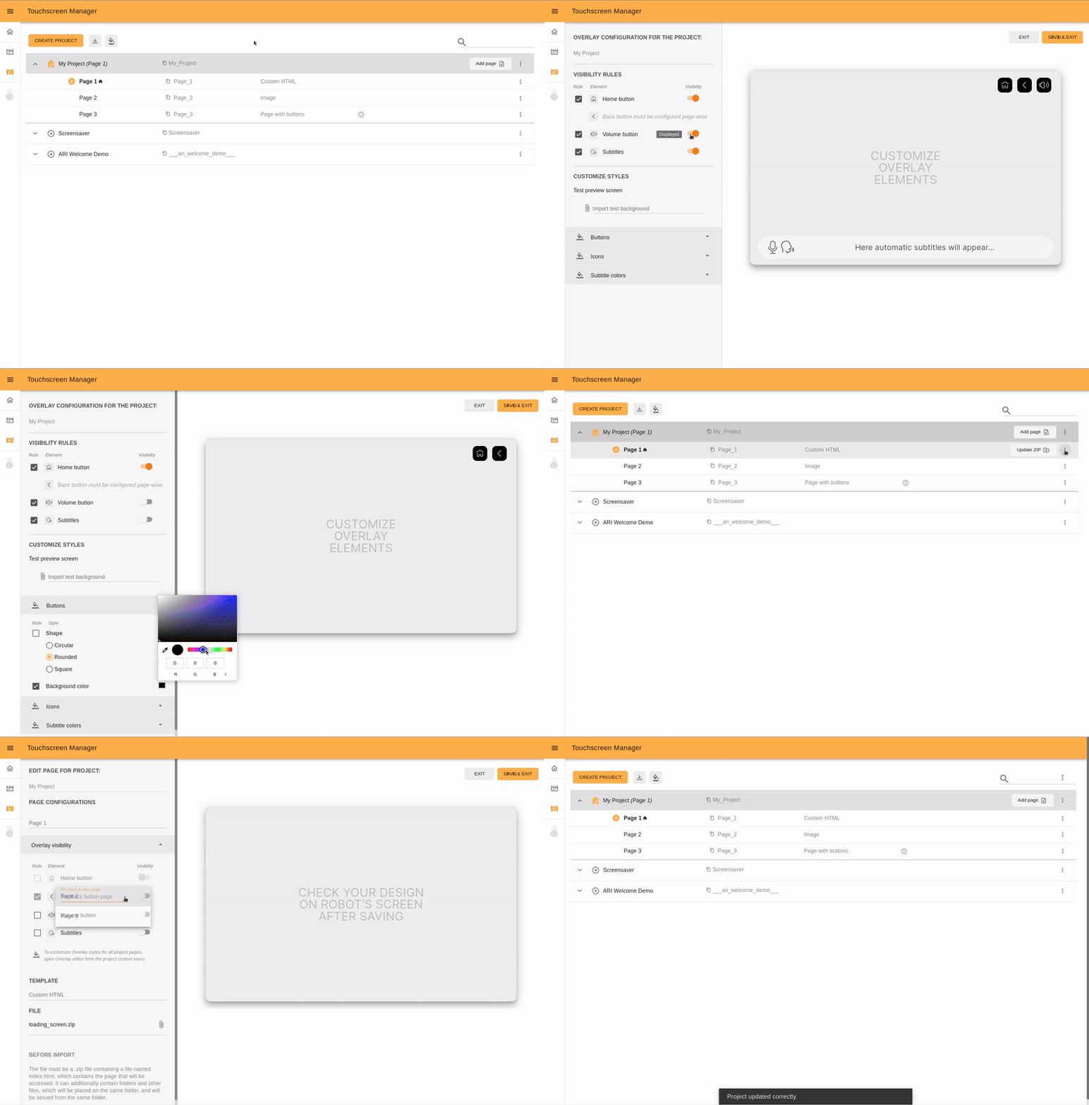
The start screen of the Touchscreen Manager contains the list of all previously created projects and options to manage and edit them.
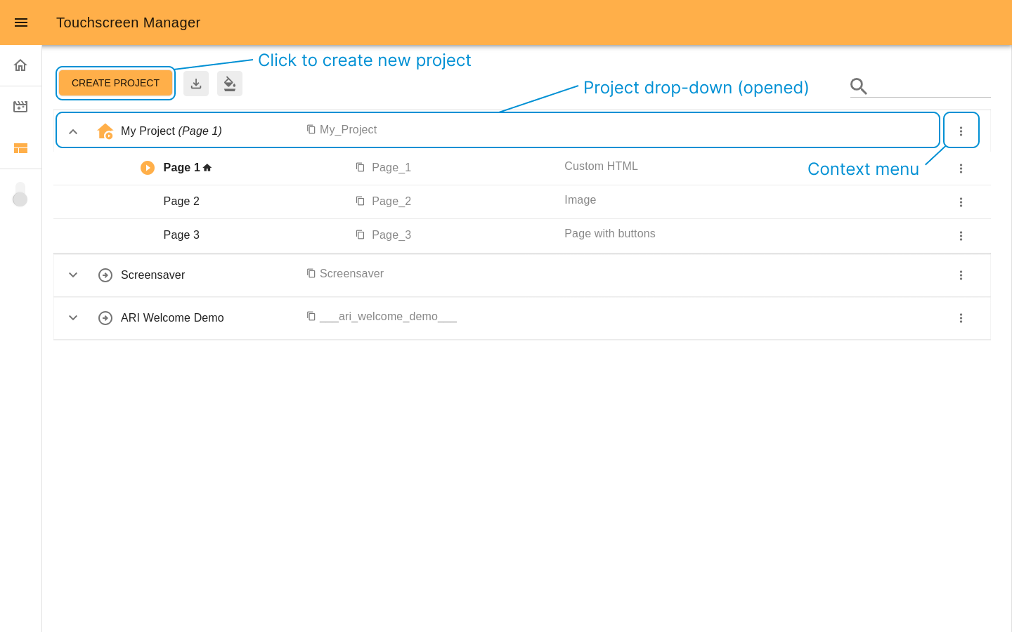
Create project button will open an popup with two options: create a project by using a visual editor or by uploading an existing project as ZIP file.
The button with arrow down icon downloads project template kit.
It is a file with SDK and a basic project structure
that can be useful to develop a project and upload it later.
The next button provide access to a visual editor
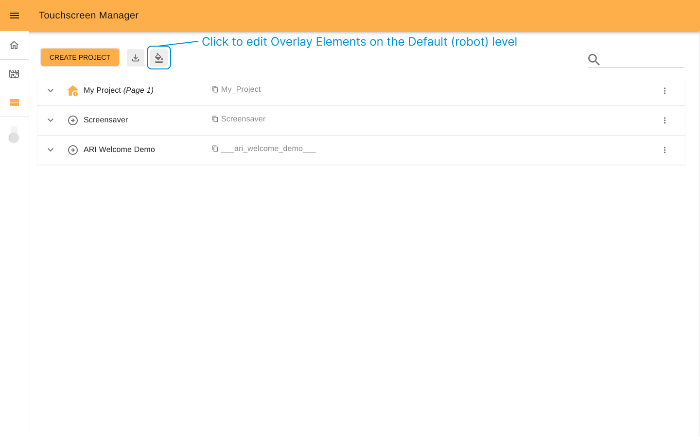
of Overlay Elements. It allows to configure the Default state of overlay.
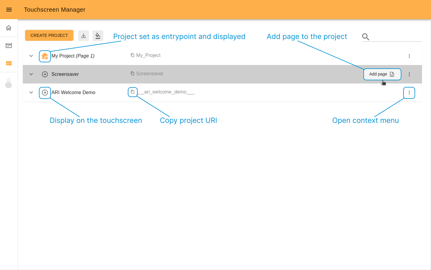
The column of dropdown panels lists all existing projects with corresponding pages. Each panel has buttons that allow you to manage projects and pages. For example, display the chosen page on the robot’s touchscreen, access to edit page content, customize project overlay, etc.
Project#
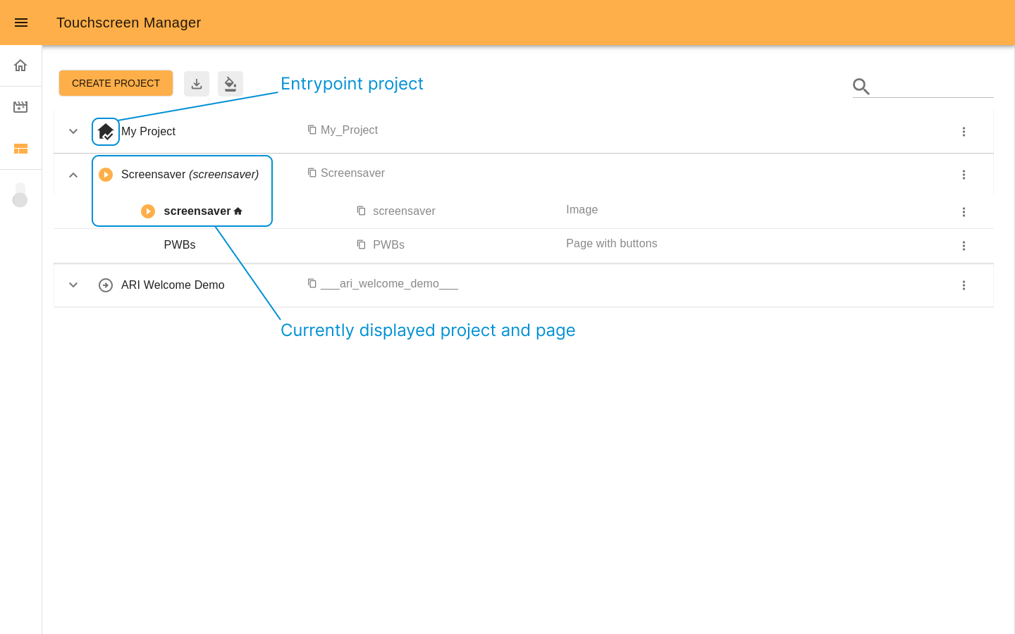
The project consists of pages that can be created through the visual editor or uploaded as ZIP files. Below you can see an example of a project structure represented as a dropdown panel with a nested pages list:

My Project (Page 1). “My Project” is a project name. It is an entrypoint project that is currently displayed on the robot’s touchscreen (marked with
icon). “(Page 1)” is a currently displayed page. The next label My_Project is the project URI that can be copied and used for development purposes.
Page 1 This page is currently displayed (marked with
icon). Also it is set as the project homepage. It means that this page will be shown once the project is displayed on the touchscreen, marked with the
icon and always goes first on the pages list.
Page_1 This a label of page URI.
Custom HTML indicates that the page Page 1 was uploaded as Custom HTML.
Page 2 It is a page that belongs to “My Project”.
Page_2 This a label of page URI.
Image indicates that his page was created from the visual editor using the Image template.
Page 3 Another page that belongs to “My Project”.
Page_3 This a label of page URI.
Page with buttons Indicates that this page was created from the visual editor using the Page with buttons template.
Note
Each project must have at least one page and no maximum number of pages, and they can use any template.
Create a project#
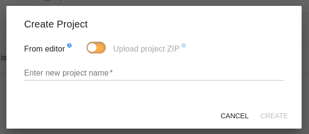
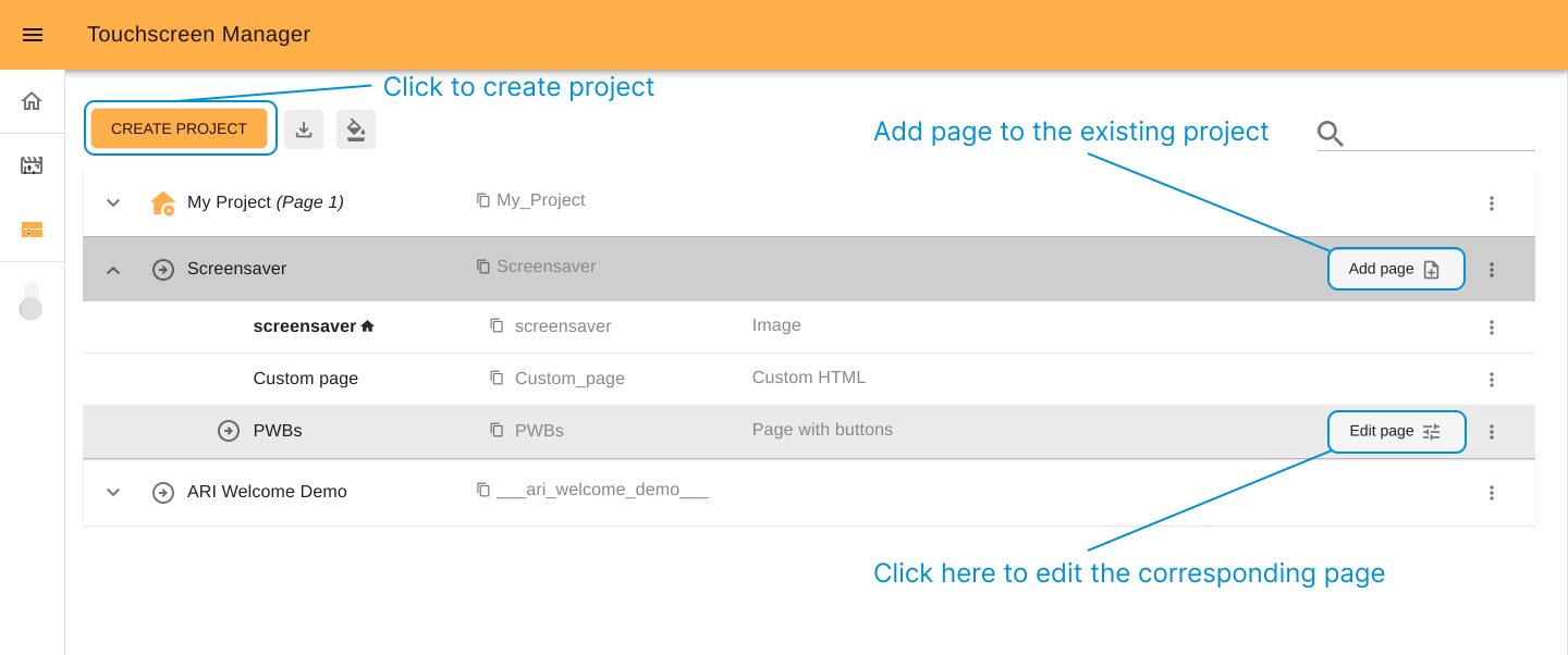
Clicking on CREATE PROJECT button on the start screen will open a popup, and from there you can create a project. There are two ways to create a project:
Create from editor#
“Create a project from the editor” means start a project from creating the first page. To do so, add the name of your project and click the CREATE button. The visual editor will then open.
Follow the steps on how to create a new page.
You can style the templates according to your needs and also manage the visibility of the Overlay Elements. The first page you create for a new project will be designated automatically as the homepage for it. (A project homepage is the page that will be presented on the Touchscreen when a project is displayed.)
Once the page is saved, the visual editor will be closed, and new project will appear at the start screen.
Upload project ZIP#
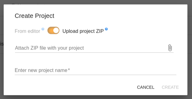
To add a new project to the Touchscreen manager by uploading a ZIP, the ZIP must meet the following requirements:
It contains a manifest.json, check the manifest structure.
Contains at least one folder with a page configuration inside.
From the start screen you have the option to download
a project template
which will contain the file structure.
To create, upload the ZIP of the project, choose a name which has not been used already, and click the CREATE button. In the case that there are some errors, feedback will be given to you on what needs correcting.
Project template kit#
Before starting development outside the visual editor, it is recommended to check the basic project
structure (SDK included) and test it in practice. To do that, click the
“Download project template” button and review the downloaded ZIP.

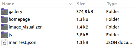
The project template ZIP file contains: the manifest.json, folders with examples of pages, and the pallib.js SDK. Using these examples you can develop your own project from scratch and afterwards upload it through Create Project -> Upload project ZIP.
Pages#
The project template ZIP comes with a basic project containing the following pages:
Homepage
Gallery
Image Visualizer.
The structure of this project’s manifest shows how each page has its own level and how the Overlay menu buttons can be used to navigate from one page to another. The folder js also contains examples of pallib.js usage.
Manifest.json structure#
The manifest.json file is a mandatory JSON file that defines the list of pages inside a project, as well as the flow of pages (check Overlay rules). If you are uploading a project by ZIP then it must be included in the ZIP file, otherwise, when creating a project from the visual editor, it will be automatically generated.
{
    "entrypoint": "homepage",
    "user_input_navigation": false,
    "pages": [
        {
            "title": "Homepage",
            "folder": "homepage",
            "template": "custom_html"
        },
        {
            "title": "Gallery",
            "folder": "gallery",
            "template": "custom_html",
            "overlay_show": {
                "volume_btn": false
            }
        },
        {
            "title": "Image visualizer",
            "folder": "image_visualizer",
            "template": "custom_html",
            "overlay_show": {
                "back_arrow_page": "gallery",
                "subtitles": false
            }
        }
    ]
}
Entrypoint: An entrypoint is considered the first level page (“homepage” -
) of a project. When a project is displayed on the touchscreen this page will be presented. When clicking on the Navigation Menu’s home button
, which can be shown on a given page that is not an entrypoint, it will bring this page into view. The value of the entrypoint is the name of the folder from the page you want as entrypoint, and it must be present in the pages list.
User input navigation: It has a boolean value (
true|false). This parameter is for advanced purposes only, and it is recommended to leave it in the default value (false) unless specifically required.False: If the value is set to false then when the user taps on the Overlay Navigation buttons (displayed on the robot’s touchscreen) it will trigger the switch between assigned pages.The home button will present the entrypoint page on the touchscreen. If the current page on the touchscreen is the entrypoint, the home button will be hidden
The back button will take you to the page defined in the back_arrow_page (the page must belong to the same project). If this value is left empty or the back_arrow_page key does not exist, the back button will be hidden. The value must be the URI (folder name) of the page you want to navigate to.
True: When user_input_navigation is set to true, tapping the home button or the back button will publish on the following ros topic /user_inputThe Home Button will publish the following input:
---
action: "TOUCHSCREEN_HOME"
args:
    -
      key: ''
      value: ''
---
The Back Button wil publish the following input:
---
action: "TOUCHSCREEN_BACK"
args:
    -
    key: "intent"
    value: "splashscreen" # defined in back_arrow_page
---
Note
When an input is sent from the Back or Home
button,
it will NOT automatically switch the page presented on the touchscreen, you
will have to manage this on your ROS node and can use the /web/go_to
topic to navigate between pages. You can use this behaviour if your WebApp manages other
aspects of the robot which need to trigger or stop actions, e.g., tasks,
motions, etc. If you just want to navigate between pages consider setting
the “user_input_navigation” key to false.
Pages: It is a list containing all the pages of your project, each page item has the following structure:
{
  "title": "User friendly name of the page",
  "folder": "page_folder_name",
  "template": "custom_html" ,
  "overlay_show": {
    "home_btn": true,
    "volume_btn": true,
    "subtitles": true,
    "back_arrow_page": "page_uri_to_go_back_to"
  }
}
The
templatekey needs to have a value from the following:custom_html
page_with_btns
slide_show
image_template
video_template
Note
When uploading a project by ZIP, if the template key is omitted it will be given the value of custom_html.
The
overlay_showis an optional key; if it is not presented, the visibility of the Overlay Elements will take value from either the project’s overlay_config or the default overlay configuration otherwise.To show the back button on a given page, the
back_arrow_pagekey must be defined and given the name of a page folder present in the pages list (which will be the page the back button will navigate to). The behavior of the home button or back button will depend on how theuser_input_navigationis defined.
PalLib#
The folder named js contains the PalLib TouchScreen SDK Offline library, which you can use for the development of your custom HTML pages. It contains the API to execute certain actions on the robot such as:
Execute motions
TTS
Switch pages
Switch projects
When uploading a project, this folder will be removed and replaced with a similar version of this library that actually connects to the robot. For this reason do not modify or add additional files to this folder, as they will be lost on upload.
Manage projects#
Manage existing projects from the start screen. All projects
are shown as a column of dropdown panels where the title is the project name
and nested list is the corresponding pages list. There are some quick access
buttons such as, for example, Add page for projects and
Edit page
for pages, and a context menu
with the list of enabled options for each project/page.
You are able to do the following for created projects:
Display project If you want to display the project immediately then click the Display project button
and it will change the state of the icon
to let you know which project is currently displayed on the screen.
Note
You can see in real-time what page is displayed even when a page is changed on the touchscreen (the displayed page name appears next to the corresponding project name between parentheses). Example: My Project (Page 1).
Another important term is the Entrypoint project: it is a project that will be shown by default every time the robot restarts. To set a project as an entrypoint project, open the Context menu
and choose Set as entrypoint project
. The chosen project will be moved to first place on the list and will have a home icon
to the left of its title. If the entrypoint project is currently displayed, the icon will be changed to
Copy URI
: Clicking on the copy icon will copy the URI of the project to the clipboard,this can be useful while programming a custom project (check pallib.js)
Add a page
: It will open the editor for you to create a new page for the project, check how to create a page.
Click on the three dots to open the context menu
for the project and you will be presented with the following options:
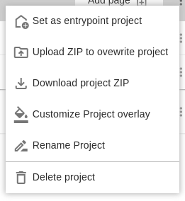
Set as entrypoint project
: Set the project as the one to be displayed by default when the robot boots up.
Upload ZIP to overwrite the project
: It opens a popup with an input to upload another ZIP file. Once the new ZIP is uploaded and saved, there is no option to restore the previous project version.
Download project ZIP
: You will be able to download the entire folder of the project with its current configuration, all its pages, and the PalLib SDK for offline development.
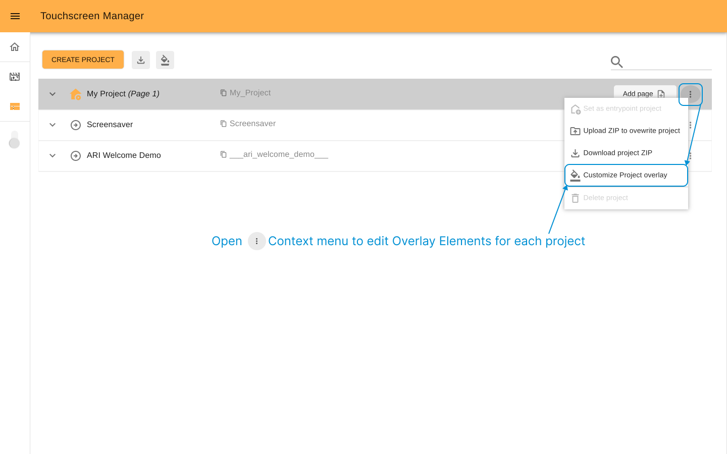
Customize Project overlay
: Click to open the soverlay editor for the specific project. Check how to customize the project overlay.
Rename project
: Set a desired name for your project. URI will not be changed.
Delete project
: You can delete a previously created project. You cannot delete the project that is currently set as the entrypoint project.
Warning
Deleting and overwriting projects cannot be undone.
Page#
In Touchscreen manager terms “page” is content you can display on the robot’s touchscreen.
There are two ways to add and edit pages: you can use one of the predesigned templates and customize it or upload a page using web development tools such as HTML, CSS, and JS. In both cases, you should start with the visual editor.
To start a new project by creating a page, click the Create project button on the start screen and choose the option “From Editor”.
To add a new page to an existing project, click the Add page button placed on the top right of the project dropdown panel.
To edit an existing page, choose the Edit page button placed on the right of the corresponding page panel or in the context page menu.
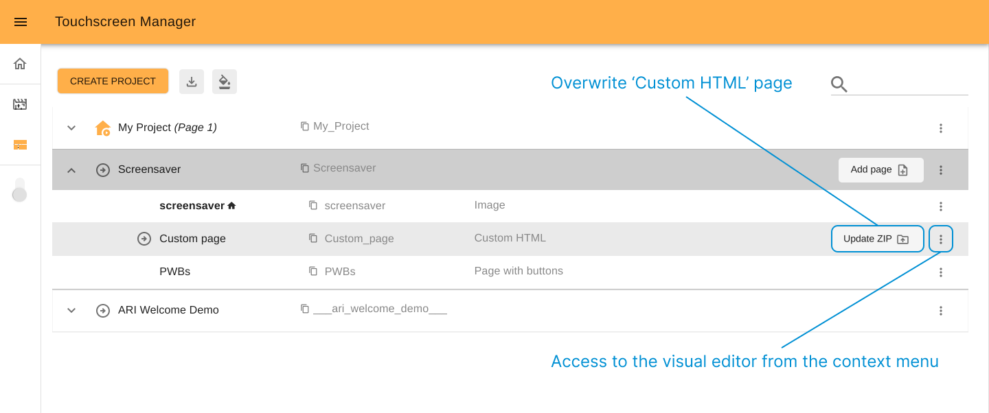
For pages uploaded as a “Custom HTML”, you can quickly access to overwriting it with another file by clicking the Upload ZIP button.
Create a page#
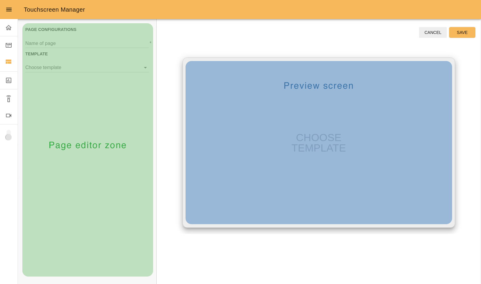
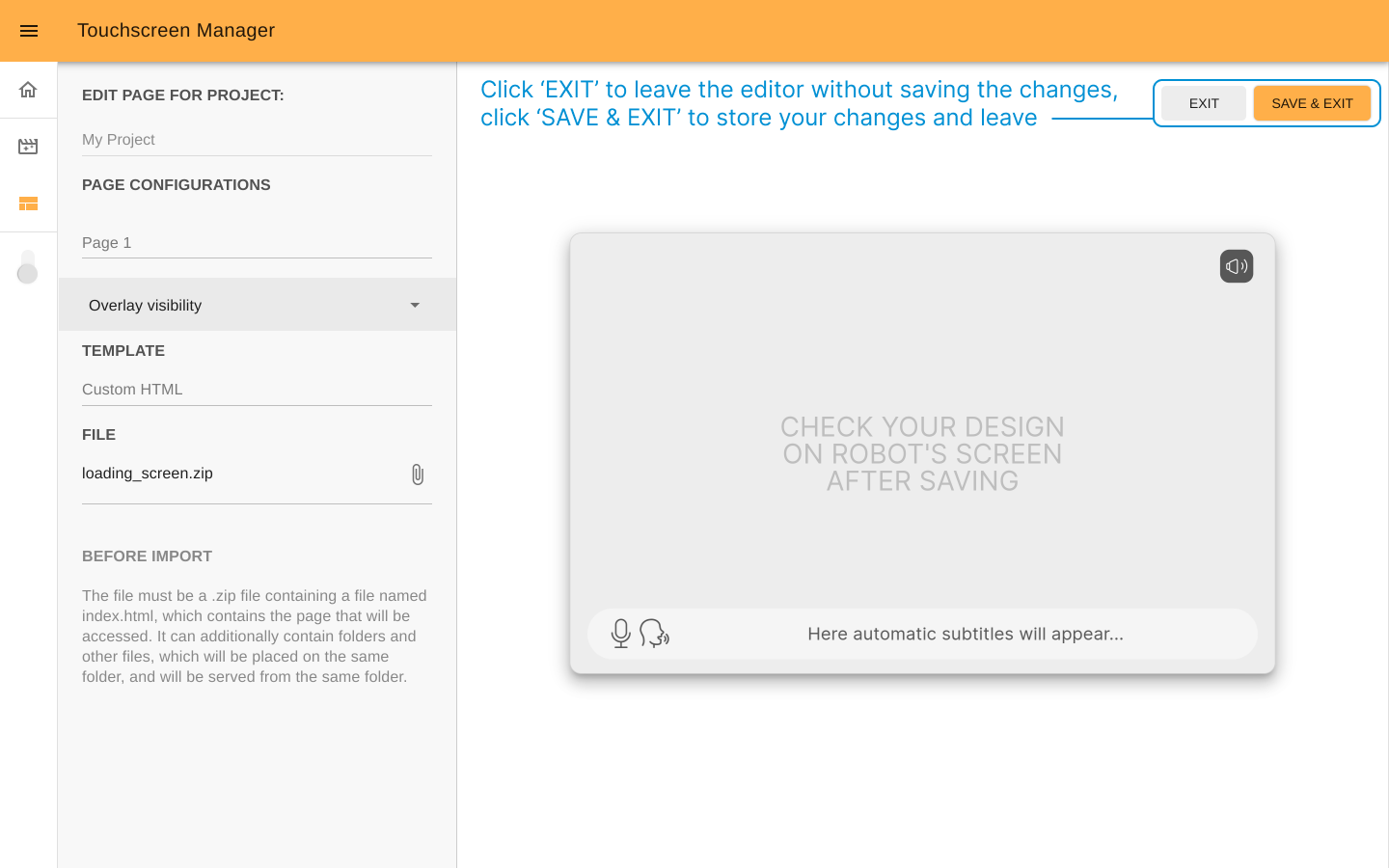
Once you access the visual editor you will see that it consists of two parts: the page editor on the left and the preview screen on the right.
All available configuration options are listed on the page editor, such as page title, template, overlay elements visibility, etc.
The preview screen serves as a virtual screen to display the page content and reflect what will be seen on the robot’s touchscreen.
Note
While you edit the page, a real-time preview is displayed on the preview screen on the right.
Follow the next steps to create a page.
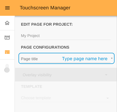
Step 1. Choose the page name. There is an option to change it later from the pages list on the start screen.
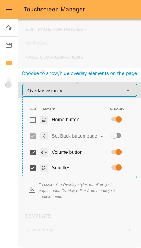
Step 2. Configure the visibility of overlay elements (optional). Here you can set individual
overlay rules for the page such as showing/hiding buttons or
subtitles and choosing a destination page for the “Back” button.
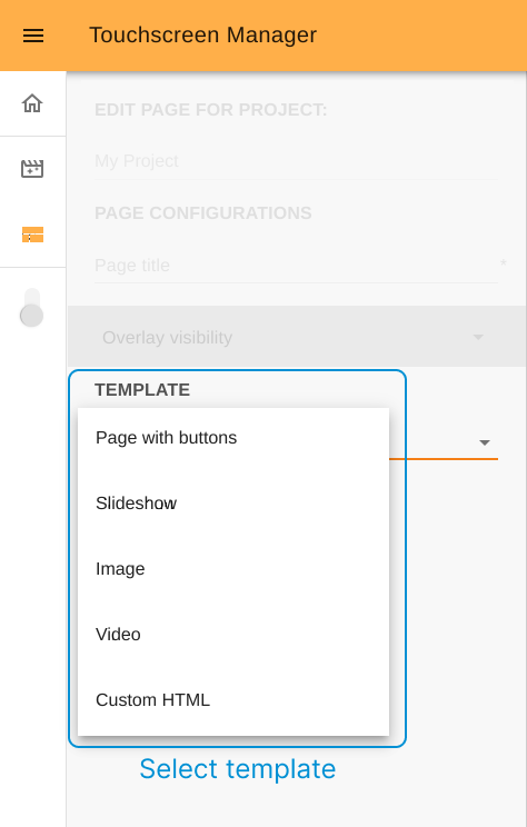
Step 3. Choose the template. The visual editor disposes of four customizable templates and one additional option which is ‘Custom HTML’ (to upload a developed external page as a ZIP file):
Slideshow template#
With this template you can create a presentation of a series of images. After choosing a page name and the Slideshow template (Steps 1 and 2), continue with the following steps.
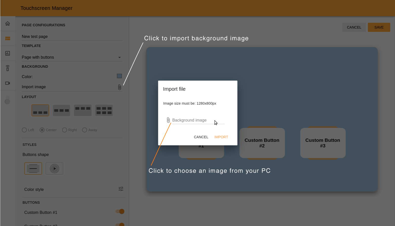
Step 4. Import photos. Click on the attach icon and
import all images you need for your slideshow. You will immediately see
the list of imported images. You can set the order in which the images
will appear by dragging and dropping them.

Step 5. Set preview settings. Choose the time delay to switch from one image to the next one. You can check the outcome by pressing the Play/Stop button. You will see the slideshow in the preview screen.
Note
Importing at least one photo and setting a time period are mandatory steps before you can use the Play button.

You can press the Stop button to pause a reproduction of the slideshow preview.
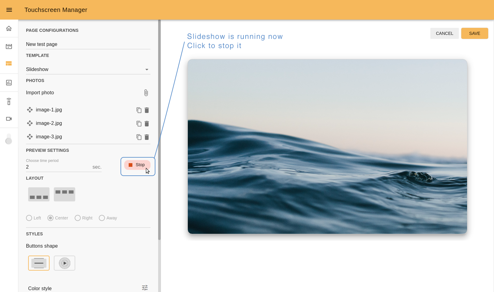
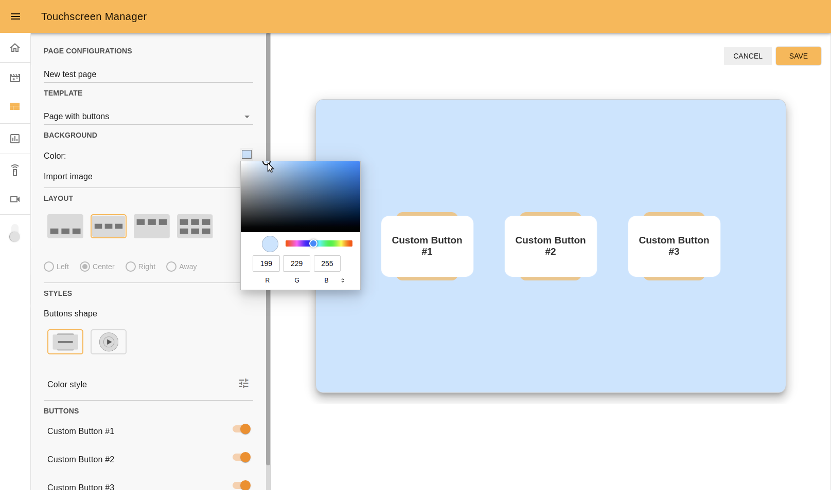
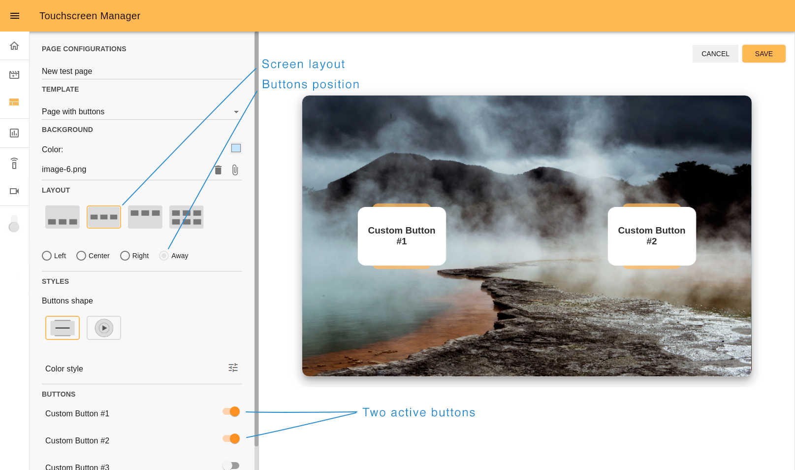
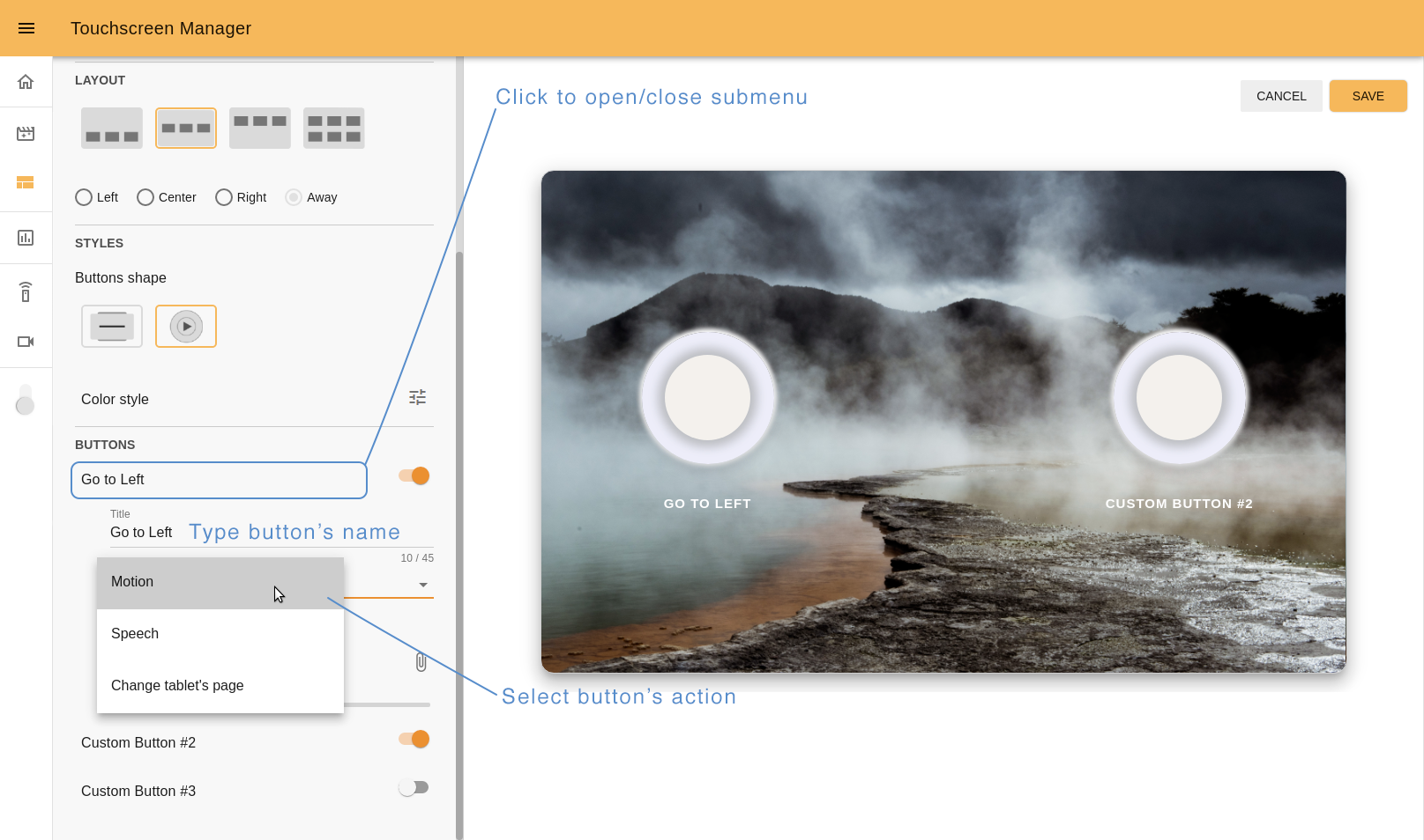
Step 6. Choose layout. It is possible to choose up to three static custom buttons to be shown during the slideshow. The buttons can be displayed either on the top area or at the bottom area. If you set less than three butons, these can also be aligned (left, center, right or away).
Step 7. Customize buttons. To customize your buttons, follow the same process as in the Page with buttons template .
Jump to Canceling or saving to continue.
Image template#
The image template is used to build web pages to show an image. After choosing a page name and the Image template (Steps 1 and 3), continue with the following steps.
Step 4. Upload image file. Click the attach icon to upload your image.
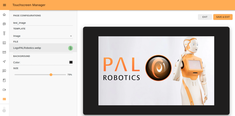
Step 5. Set background color. Optionally you can pick the background color that will be visible if the uploaded image doesn’t cover the full-screen.
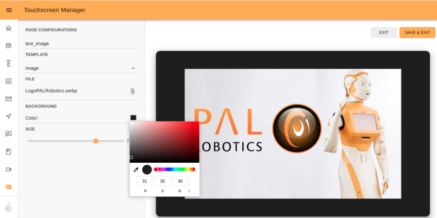
Step 6. Set image size. Move the slider to change the size of the image.
Jump to Canceling or saving to continue.
Video template#
The video template is used to build web pages to show a video. After choosing a page name and the Video template (Steps 1 and 3), continue with the following steps.
Step 4. Upload video file. Click the attach icon to upload your file.
Note
The supported video format is MP4.
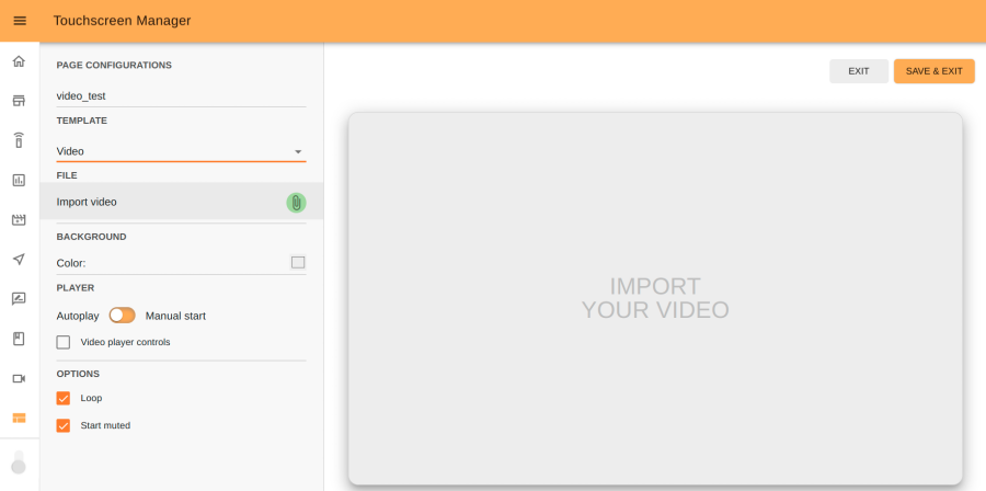
Step 5. Set background color. Optionally you can pick the background color that will be visible if the uploaded video doesn’t cover the full-screen.
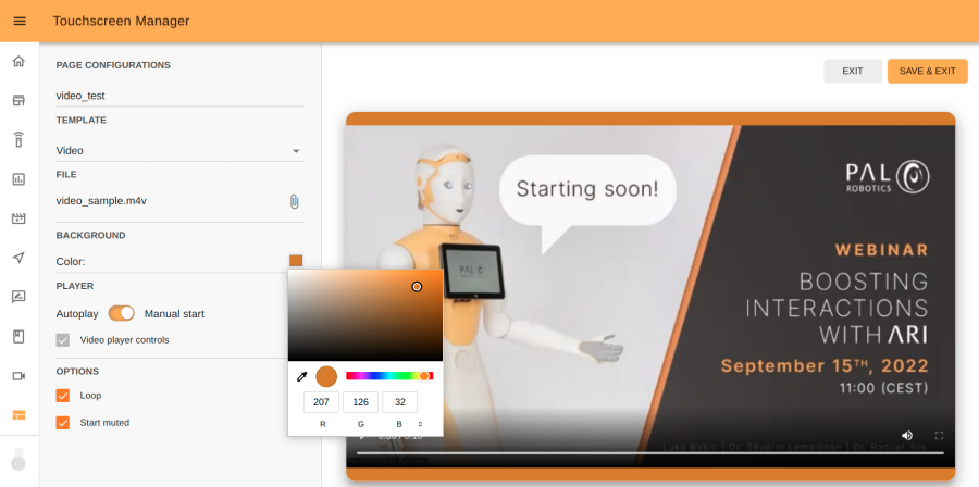
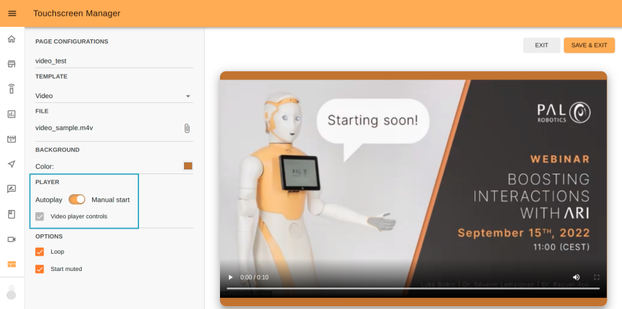
Step 6. Set player control. You can opt for Autoplay or Manual start. In the former case, the video will automatically start as soon as you publish the page. In the latter case, player controls will appear below the video so you can manually control the video player. In automatic mode you can also have player controls by selecting the Video player controls option.
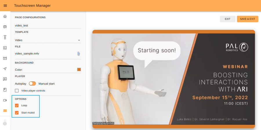
Step 7. Additional options. With these additional options you can choose to play the video in Loop mode and whether you want to start the video in Muted mode.
Jump to Canceling or saving to continue.
Custom HTML#
This template can be used if you want to display a webpage developed externally. Follow steps
1, 2 and 3. Next, click the attach icon in the File section and import ZIP
file that contains your page.
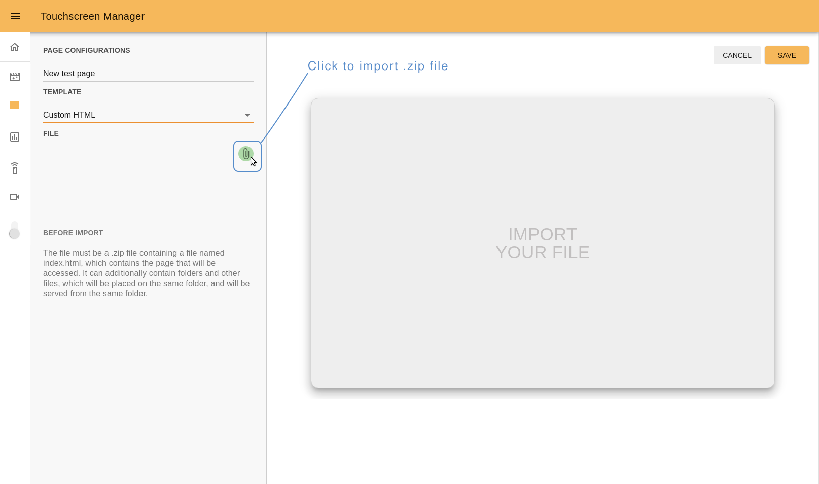
To display your webpage correctly, you must follow the next guidelines:
The file must be a
.zipformat;A ZIP file must contain a file named
index.html, which contains the page that will be accessed;(Optional) allow at least 15px on the boundaries to avoid accessibility problems with the touchscreen frame;
(Optional) use
touch events(https://developer.mozilla.org/en-US/docs/Web/API/Touch_events) to manage the interaction in JS;A simple example of how files can be organized before the ZIP compression follows:
game_example.zip
   - index.html
   - js
       - main.js
       - utils.js
   - styles
       - game.css
You can use
jslibraries such asVueandReact. The only requirement is that everything is contained in the ZIP file.
Note
While editing the Custom HTML template you cannot visulize the output. You will have to display the page on the robot’s touchscren to view the results.
To know more about developement of project and pages for the robot’s touchscreen, check the section Project template kit.
If you want to learn how to get the input from interactions with the touchscreen through ROS, check the Tutorial: Building a first touchscreen interaction how-to.
Canceling or saving#
You can cancel the process or save it after you are done by pressing the CANCEL or SAVE buttons, respectively:
CANCEL: if you want to stop editing and don’t want to save your progress.
SAVE: to save your work and go back to the project list
Manage pages#
Click on the project to open the dropdown list and see its pages.
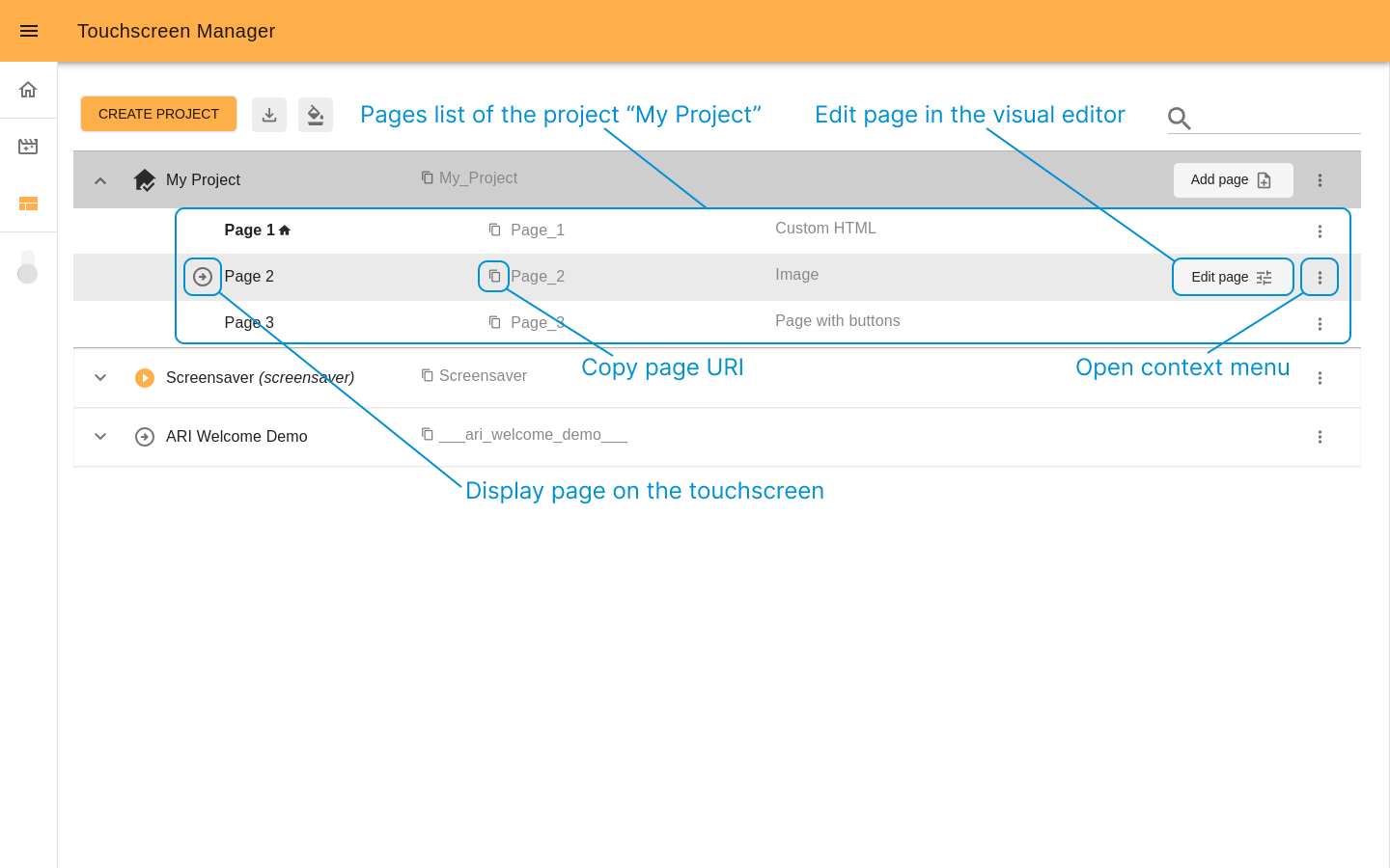
You can manage each page individually with the following options:
Display the page on the touchscreen
: click here to present the chosen page on the robot’s touchscreen. It will change the state of the icon
to let you know which page is currently displayed and the page title will appear close to the project name. If the project to which the page belongs wasn’t displayed before, it also will automatically set it as displayed.
Edit page: For pages uploaded as Custom HTML, you can update the ZIP directly from the Update ZIP
button. For pages created with visual templates, use the Edit page
button to access the editor.
Open the context menu
for a page to do the following:
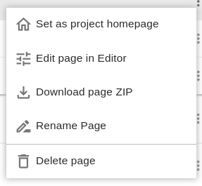
Set page as project homepage
if not currently set. The project homepage will be shown once the project is displayed on the touchscreen, marked with the
icon and always goes first on the pages list.
Edit page in Editor
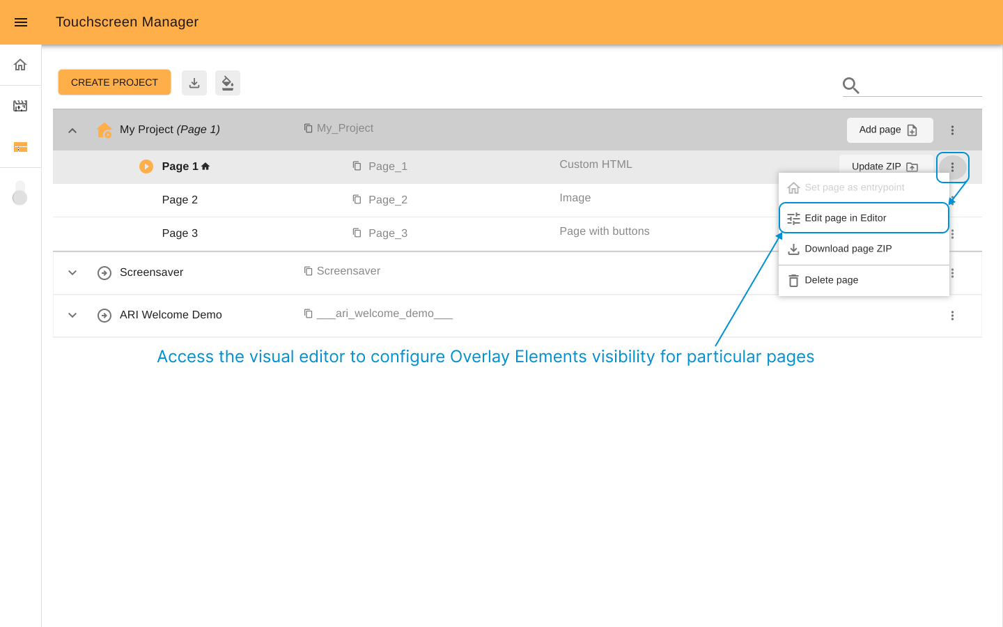
: this option will be accessible only for pages created as Custom HTML, allowing you to update ZIP or configure Overlay Elements visibility.
Download page ZIP
: Download the contents of the particular page folder.
Rename page
: Set a desired name for your page. URI will not be changed.
-
You may delete the page if the project has more than one page.
If the current page is set as a homepage
then you will be prompted to choose another one as a homepage before deleting it.
When deleting a page assigned to the “Back”
button in another page, in that page the “Back” button will be hidden as this page is deleted.
If this page is referenced in other pages, (independently of the used template), the page’s relationships must be updated manually.
Overlay#
In the context of Touchscreen manager the “overlay” (or “Overlay Elements”) are common parts of the interface that can be used to connect pages between them (via Navigation buttons), to add additional control for the robot’s volume, and/or to visualise the robot’s recognised and pronounced text as subtitles.
The overlay elements will always be overlaid on the pages, but their visibility and styles can be managed in different levels.
Interface elements#
The overlay has two main components: the Navigation Menu (will be shown at the top right corner) and the Subtitles (at the bottom of the page).
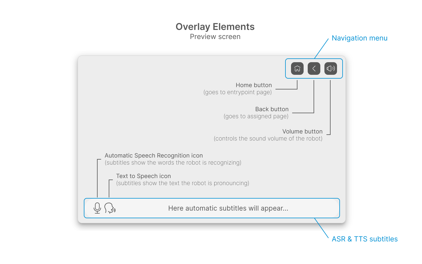
- The Navigation Menu has the following elements with their own functionality
(once the project is displayed on the robot’s touchscreen):
The Subtitles will show text containing TTS (text to speech) done by the robot and the ASR (Automatic Speech Recognition) detected by the robot in real-time.
Each Overlay Element can be shown or hidden as your project logic requires it. Check the Visibility rules section to know more.
Priority levels#
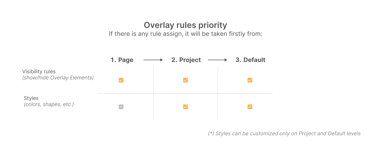
Overlay elements can be customized in different levels. There are three of them: Default, Project and Page.
Note
The general recommendation is to start from Default (robot) level, and after that to tune the configuration for a particular project if it is required, and at the end to configure specific pages inside projects if this is needed.
The following explains how to access each level to edit it.
Default Overlay: This is the robot level overlay, which values (elements visibility or styles) taken for all the projects unless the projects have their own configurations.
Project Overlay: Each project can have its own overlay configuration, visibility of elements and styles. In case no specific rules are assigned, the Default level values will be taken.
Page Overlay: there is a possibility to choose show or hide Overlay Elements for each individual page in the visual editor. That will override the previous two levels.
Visibility rules#
Toggle the Visibility switcher to choose if you want an element to be shown or hidden.
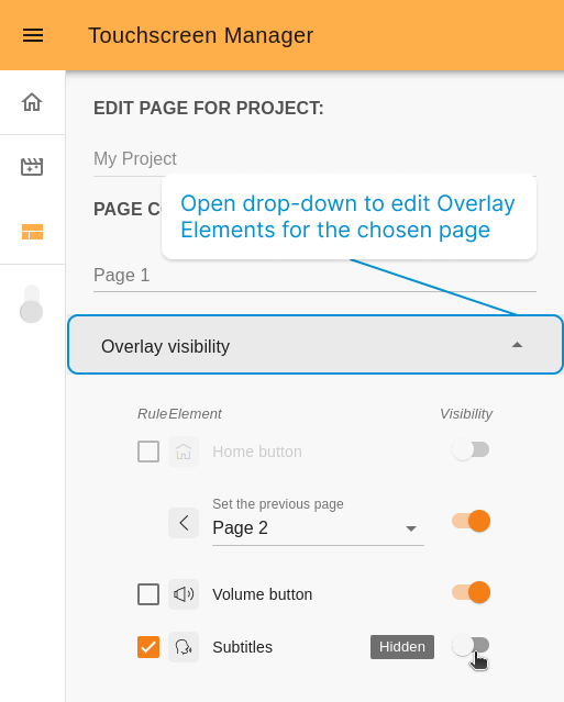
When editing the overlay visibility at Page or Project level, you will see an
additional Rule checkbox.
If the checkbox is marked the value specified on the rule will be applied.
If the checkbox is unmarked, then the value of the previous level (Project or Default) will be applied and the Visibility switcher will automatically reflect it.
Note
The changes of Overlay Elements are not displayed on the preview screen of the page’s visual editor
Example for editing of Overlay visibility rules at the Page level:
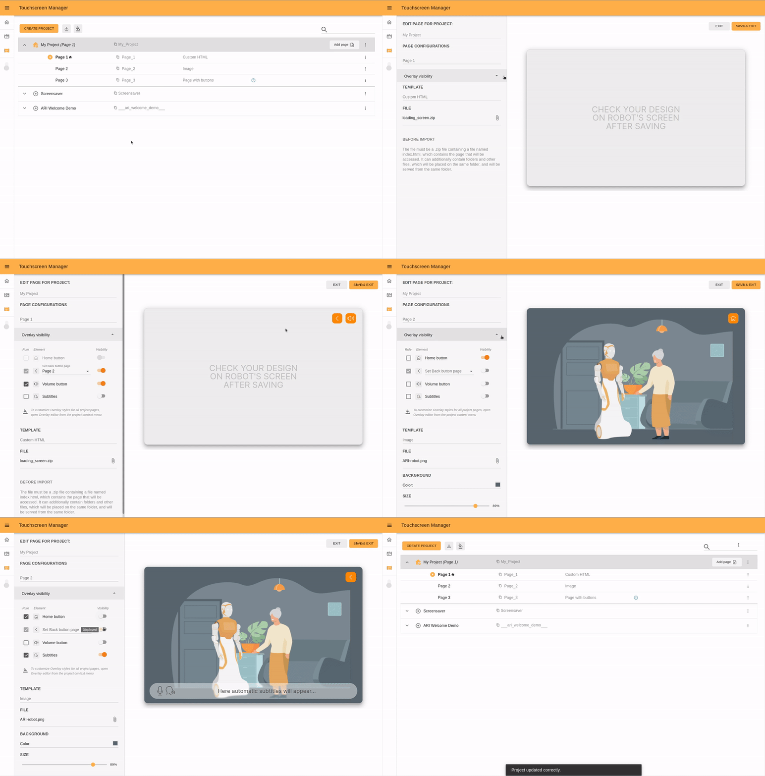
Use case example
To understand better the logic of Overlay rules, check the following use case example:
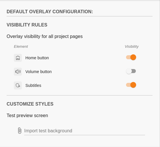
Let’s take the volume button. In the Default level, it is set as NOT visible.
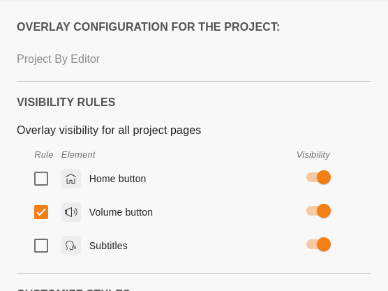
In the Project level, it is set as visible. It is different from the previous (Default) level, so the Rule checkbox is active.
The page level does not have the Rule checkbox marked, so it is taking the value from the previous level, in this case from the Project. As a result, currently for the particular page, we are editing the volume button set as visible.
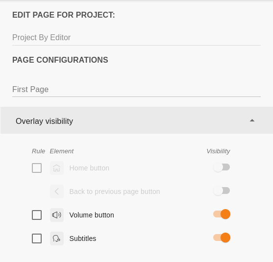
We want to have the volume button as NOT visible (opposite of the values set in the Project level). When we toggle the switch to NOT visible, we will see that the Rule checkbox is automatically marked as active (because the value was specified).
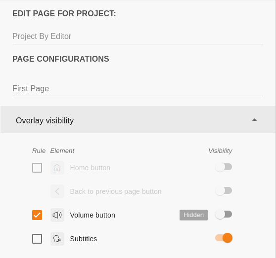
So, now for the chosen page, we set only one active rule: the volume button is visible. Visibility rules of the other elements will be taken from the previous levels (from the Project if the values were specified or from the Default one, according to the priority rules policy).
Customize styles#
Styles can be configured at Default level and at Project level. When we first create a new project all the style and visibility rules are taken from the Default level.
If we select to edit the project overlay, the new values will be taken as the active rule (overriding the Default level).
There is an option to go back to the Default level values just by unmarking the Rule checkbox. Corresponding values will be applied automatically.
Overlay editor has the next options to customize styles:
Test preview screen: You can import a temporal test image (it could be a screenshot or design image file) to configure the Overlay Elements styles in a more visual way. The uploaded image will not be saved, it is displayed only while you edit the Overlay.
Buttons: Style the Navigation Menu buttons by configuring:
Shape: choose choose between the different options:
Circular
Rounded
Square
Background color of the buttons.
Icons: Configure the following for the icons:
Shape:
Rounded
Square
Type:
Filled
Outlined
Icon color
Subtitle colors
Icon: choose the color of the subtitles icon, the shape and type of these will be same as the configured for the Navigation Buttons
Text: select the color of the subtitles text.
Background: pick a color for the subtitle overlay container.
The example of Overlay Elements customization in Project and Page levels:
